Preview image. Unlock full-res
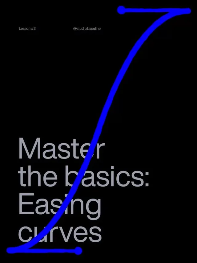
Educational graphic using a bright blue bezier curve as a visual metaphor for learning design fundamentals, set against a black background.
Summary
Educational graphic using a bright blue bezier curve as a visual metaphor for learning design fundamentals, set against a black background.
Visual description
A striking composition of pure geometry and type on black. A glowing electric-blue path curves diagonally from the lower left to the upper right, rendered as a smooth bezier line with control-point circles at each end. The curve flows through the left-aligned text "Master the basics: Easing curves," breaking the reading order and forcing the eye to follow the path. Small text at the top left reads "Lesson #3" and "@studio.baseline." The sans-serif type is set in a light, open weight, rendered in a soft gray that maintains high contrast against the black. The visual metaphor is direct: the curve itself is what is being taught.
Key takeaway
Using a single, carefully drawn geometric element as both the design focus and the teaching subject creates immediate coherence. The bright, nearly neon blue against pure black creates maximum contrast and draws the viewer in. Placing text around or through the central element rather than beside it creates active engagement with the learning content. This approach works for any educational content where the subject can be visualized.
Reuse notes
Ideal for design education, software tutorials, online courses, and skill-building graphics. The high-contrast approach ensures legibility at any size and on any platform. Works well for social media, course landing pages, and lesson-specific promotional graphics. The minimalist approach feels premium and focused. Pair with a matching visual system for a series (lesson 1, 2, 3, etc). Avoid if your audience prefers warm or friendly aesthetics.
More like this




Keep what you find
A free account saves references to boards and can send you a weekly email of picks based on what you save.
To see every result, go Pro.