Preview image. Unlock full-res
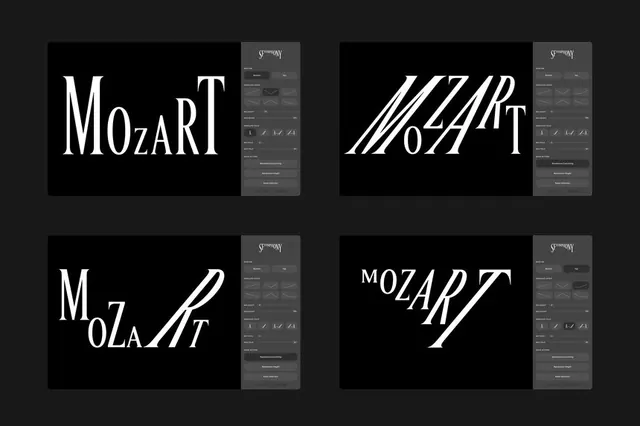
Four monochrome logotype variations of Mozart rendered in different serif typeface treatments on a dark background.
Summary
Four monochrome logotype studies for Mozart, each exploring a distinct serif typeface interpretation with different weights and spatial treatments.
Visual description
A 2x2 grid of black backgrounds, each containing a white logotype spelling "Mozart" or a stylized variant. Top-left: a traditional, tightly-spaced serif treatment. Top-right: diagonal parallel strokes creating an abstract geometric reading. Bottom-left: a flowing, cursive-influenced serif with loose letter spacing. Bottom-right: italicized serif with a classical diagonal thrust. Each study has a small grey design panel to the right showing interface controls or font settings. The overall background is very dark grey, making the white type pop with high contrast.
Key takeaway
The systematic typographic exploration showing how serif weight, angle, and spacing change brand personality while maintaining a single cultural subject. The paired grey control panel suggests this is a designer's working document, adding authenticity. The monochrome palette keeps focus on letterform refinement without color distraction.
Reuse notes
Excellent reference for cultural or classical brands (music, publishing, heritage). Use when you need to show typographic variety within a single logotype or when developing a serif-based wordmark system. Works best with high-contrast, editorial aesthetics. The design system approach suits institutional or luxury contexts.
More like this






Keep what you find
A free account saves references to boards and can send you a weekly email of picks based on what you save.
To see every result, go Pro.