Preview image. Unlock full-res
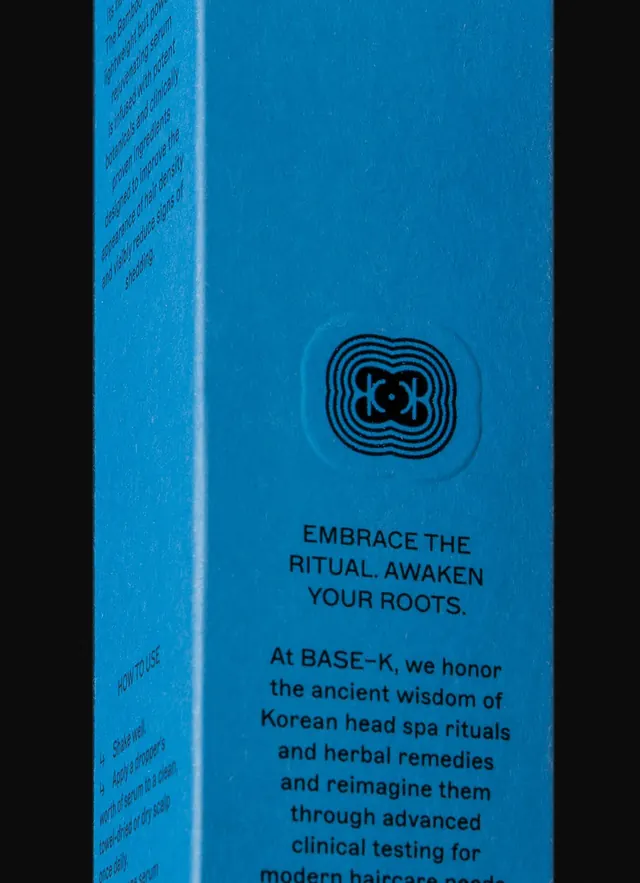
Premium skincare product packaging in bright cyan blue featuring a concentric geometric logo mark and wellness-focused copy explaining the brand's herbal and clinical approach.
Summary
Premium cosmetics packaging for BASE-K in bright cyan blue with a concentric circular geometric mark and messaging that positions ancient Korean spa wisdom alongside modern clinical innovation.
Visual description
A cyan-blue product box photographed at an angle showing the spine and front face. The front features a concentric circular geometric logo (nested squares rotated and scaled, forming a bulbous flower-like pattern) printed in dark navy at center. Below the logo, black sans-serif text reads "EMBRACE THE RITUAL. AWAKEN YOUR ROOTS." followed by body copy explaining the brand's philosophy: "At BASE-K, we honor the ancient wisdom of Korean head spa rituals and herbal remedies and reimagine them through advanced clinical testing for modern haircare needs." The spine contains small repeated text (likely ingredient or regulatory information). The cyan blue is saturated and matte, creating a cool, calming, premium impression.
Key takeaway
Concentric geometric logo that combines structure with organic sensibility, making it memorable without being overly complex. Headline pairing abstract concept ("Ritual," "Roots") with pragmatic benefit ("Awaken"). The monochromatic color story (one vibrant base with black typography) creates premium clarity on shelf. Body copy that transparently bridges tradition and science, acknowledging both heritage and modern efficacy.
Reuse notes
Highly effective for beauty and wellness brands that position themselves at the intersection of natural heritage and clinical validation. The cyan blue reads as fresh and trustworthy; use of a single bold color keeps production costs reasonable while projecting premium perception. Works well for Korean or East Asian beauty brands targeting conscious consumers. The geometric logo is scalable and works across packaging formats (bottles, jars, sachets).
More like this


Keep what you find
A free account saves references to boards and can send you a weekly email of picks based on what you save.
To see every result, go Pro.