Preview image. Unlock full-res
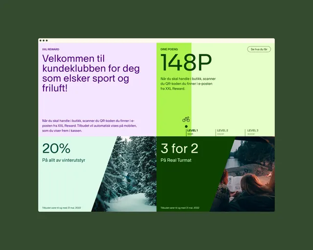
Six-block grid promotional card with forest green background, pink headline block, lime offer block with KPI, nature image, and discount callouts in sans-serif.
Summary
Six-block promotional card layered on forest green background with playful geometric color blocks (pink, lime, lavender), oversized KPI numbers, nature photography, and benefits text in Scandinavian-style serif typography.
Visual description
Soft-white card on dark forest green background with six uneven blocks arranged in a loose grid. Top-left: pink section with purple headline text in Norwegian ("Velkommen til..."). Top-right: lime section with oversized "148P" in sans-serif and small text about benefits. Middle: nature photograph of a winter forest. Bottom-left: soft pink block with "20%" discount text. Bottom-right: forest green block with "3 for 2" offer and a nature image. All text is clean serif or sans-serif in dark or white. Generous padding and breathing room between blocks. Overall feel is cozy, grounded, and sophisticated.
Key takeaway
The geometric block approach to breaking up promotional information without appearing chaotic. The use of nature imagery (forest, water) to establish a cohesive, trustworthy retail brand. The large, legible numbers (20%, 148P, 3 for 2) that make offers immediately scannable. The soft pastel accent colors that differentiate sections without screaming.
Reuse notes
Works particularly well for retail loyalty programs, subscription tier cards, or seasonal promotional campaigns. The nature-forward aesthetic suits outdoor, organic, or lifestyle brands. The grid can flex to 4, 6, or 8 blocks depending on content needs. Pair with photography consistent in mood and palette for maximum cohesion.
More like this


Keep what you find
A free account saves references to boards and can send you a weekly email of picks based on what you save.
To see every result, go Pro.