Preview image. Unlock full-res
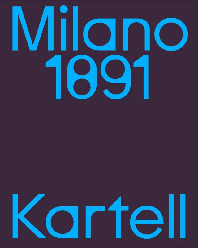
Two-line type specimen in vibrant cyan sans-serif lettering and wordmark stacked vertically against a deep charcoal-purple background.
Summary
A two-line type specimen displaying "Milano 1891" above "Kartell" in bright cyan sans-serif letters with rounded terminals against a rich purple-gray background.
Visual description
Bright cyan geometric sans-serif with consistent stroke weight throughout, using rounded cut corners and circular terminals (the "o" in both lines is a perfect circle). "Milano 1891" dominates the upper third in larger scale, with numbers rendered in the same contemporary geometric style. "Kartell" sits in the lower third, same typeface family, with the distinctive rounded letterforms reinforced at this smaller scale. The dark purple-gray background creates intense contrast, almost neon effect, with generous negative space between the two text blocks. No secondary visual elements, pure typography-forward composition.
Key takeaway
The type itself: rounded-terminal geometric sans-serif that reads modern and playful despite all-caps formality. The color pairing (bright cyan on dark purplish gray) creates maximum visual pop without harsh black-and-white. Stacked-text layout with breathing room between lines works for brand names or presentation covers where you want one strong visual anchor.
Reuse notes
Strong for luxury brand identity, design studio signage, or contemporary furniture/product catalogs. The high neon-to-dark ratio works best on light walls or dark digital backgrounds; harder to read on mid-tone surfaces. Pairs well with minimalist layouts and generous whitespace.
More like this



Keep what you find
A free account saves references to boards and can send you a weekly email of picks based on what you save.
To see every result, go Pro.