Preview image. Unlock full-res
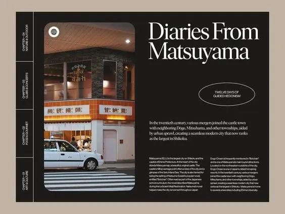
Left-aligned editorial spread pairing large serif headline with storefront photograph and body copy on dark background.
Summary
Left-aligned editorial spread pairing large serif headline with storefront photograph and body copy on dark background.
Visual description
Two-column editorial layout on a charcoal-to-brown background. Left column is a narrow vertical space with label text in small serif. Center column features a rounded-rectangle photograph of a storefront with signage and a parked car, shot during daytime. Large serif headline "Diaries From Matsuyama" sits above and to the right of the image, flush-left, in off-white. Below the image, small sans-serif body copy fills the right column, arranged in a tight measure. A small oval callout with italicized text accents the upper-right. The color palette is earthy and muted: dark charcoal, warm taupes, and cream. Generous white space and strong vertical divisions create a calm, magazine-quality hierarchy.
Key takeaway
Pairing a bold serif headline with restraint in surrounding elements (dark background, minimal decoration) makes typography the primary visual anchor. Rounded-corner photograph framing softens what might otherwise feel austere. Asymmetric layout (image left, headline right) creates movement and visual interest without clutter. The warm, muted palette lends editorial credibility and allows photography and type to dominate equally.
Reuse notes
Ideal for travel publications, cultural features, or lifestyle editorials where photography is secondary to narrative. The serif headline works especially well for longform stories or literary pieces. Works across print and digital when the layout is adjusted for screen. Pair serif with warm neutrals for sophistication; add a pop of accent color sparingly if needed. The narrow left column can hold metadata (section, date, author) or decorative elements. Best used when the photograph itself is sharp and compelling enough to anchor the page.
More like this


Keep what you find
A free account saves references to boards and can send you a weekly email of picks based on what you save.
To see every result, go Pro.