Preview image. Unlock full-res
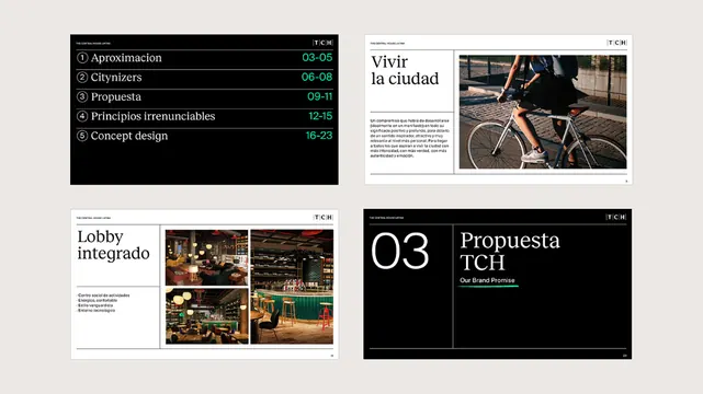
Four-panel editorial spread combining structured type hierarchy, dark monochromatic backgrounds, photography, and warm earth tones for urban design or architecture content.
Summary
Four-panel editorial layout alternating dark backgrounds with image-and-type combinations, structured around a serif/sans-serif contrast and warm monochromatic palette suited to architecture or planning topics.
Visual description
Top left: numbered list (01 Aproximacion, 02 Cinéfores, 03 Propuesta, etc.) in white sans-serif on black. Top right: "Vivir la ciudad" headline with a cropped bicycle image. Bottom left: "Lobby integrado" with three stacked imagery tiles showing interior spaces. Bottom right: section divider in black, bright cyan accent, and "03 Propuesta TCH" label. Serif typeface pairs with sans-serif throughout. Warm earth tones underpin the photographic content; ample black and white create breathing room. The grid is rigorous, with consistent gutters and a modular rhythm.
Key takeaway
The numbered section-list treatment (01, 02, 03 in colored boxes) for navigating long-form editorial content. The alternation of dark and light panels to maintain visual rhythm without losing hierarchy. Pairing serif display type with sans-serif body for an editorial voice that feels both contemporary and considered.
Reuse notes
Effective for architecture, urban design, or long-form editorial projects where a serious, research-backed tone is desired. Scales well to 6+ pages. Cyan or bright accent color is optional; adjust to brand palette. Works best when photography is strong and content-rich.
More like this



Keep what you find
A free account saves references to boards and can send you a weekly email of picks based on what you save.
To see every result, go Pro.