Preview image. Unlock full-res
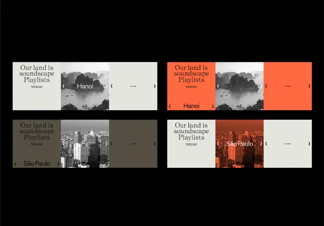
A 2x2 grid of playlist cards alternating between black and white photographs and solid color blocks, with minimal serif label text.
Summary
A 2x2 grid of playlist cards alternating between black and white photographs and solid color blocks, with minimal serif label text and terracotta accent.
Visual description
Two by two grid of rectangular cards, each roughly square-proportioned. Top-left and bottom-left contain grayscale photographic crops with italic serif text overlaid (locations like "Hanoi" and "Sao Paulo"). Top-right is solid burnt orange with white text. Bottom-right is white with terracotta text. A repeating label "Our land is soundscape Playlists" appears in each card, suggesting a location-based audio product. The overall palette is restricted: black, white, warm terracotta orange, and neutral stone gray.
Key takeaway
The alternation between photograph and solid color to break visual repetition while maintaining grid discipline. The warm accent color (terracotta) used sparingly as a highlight. Minimal serif typography that reads well small and adds sophistication to simple layout.
Reuse notes
Effective for music or audio product interfaces, travel or location-based content cards, and portfolio/case-study grids. The monochromatic photography paired with one warm accent tone works well when you want calm + legibility without visual chaos.
More like this


Keep what you find
A free account saves references to boards and can send you a weekly email of picks based on what you save.
To see every result, go Pro.