Preview image. Unlock full-res
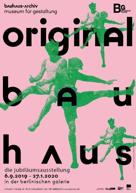
Anniversary exhibition poster featuring halftone human figures in bright green against a soft pink ground, with oversized black sans-serif typography integrated into the composition.
Summary
Bauhaus Archive anniversary poster with halftone human figures in bright green on soft pink, featuring typography integrated as compositional elements rather than ancillary text.
Visual description
Soft pink background with three layered halftone human figures in bright green, rendered in a pixelated dot-matrix style with varied densities creating form and dimension. The figures are dynamic and overlapping in diagonal composition. Large, bold black sans-serif typography (geometric grotesque) is scattered throughout the composition, with letter forms integrated into the spatial arrangement rather than set in traditional type blocks. Small text at bottom right and top left provides exhibition information and branding. The overall effect balances figural abstraction with typographic weight.
Key takeaway
Typography functioning as a design element equal to imagery rather than purely informational. The halftone technique creating depth and movement while maintaining high color contrast. Using complementary colors (pink and green) for visual punch on a museum poster.
Reuse notes
Strong approach for cultural institution identity and exhibition graphics. Particularly effective when the audience expects experimental visual language. The halftone-on-solid background pattern works well for posters and large-format print where legibility needs dynamism.
More like this

Keep what you find
A free account saves references to boards and can send you a weekly email of picks based on what you save.
To see every result, go Pro.