Preview image. Unlock full-res
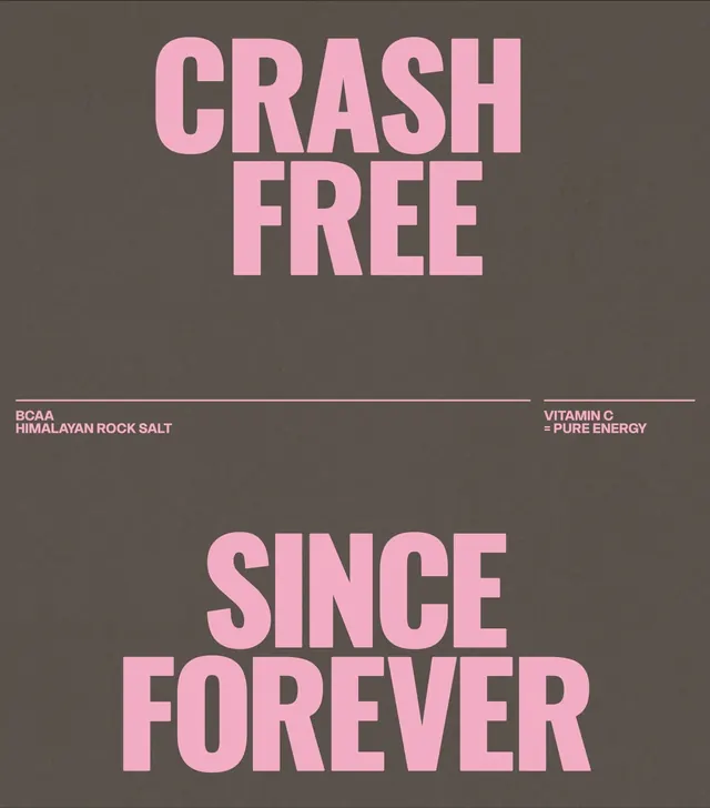
Two-word headline in bold pink capitals centered on a taupe ground, with product ingredient claims in pale pink text below.
Summary
Bold display capitals spelling "CRASH FREE" and "SINCE FOREVER" anchor a supplement label, in soft pink against a warm taupe ground with secondary ingredient claims in smaller type.
Visual description
Composition centered vertically on a warm taupe background. Top third contains all-caps "CRASH FREE" in bold pink display type, no serifs, fairly extended letter-spacing. Middle third is open space. Bottom two-thirds contain "SINCE FOREVER" in the same pink display font at a similar scale. Horizontal separator lines above and below a middle band of pale pink body copy reading "BCAA HIMALAYAN ROCK SALT" on one side and "VITAMIN C = PURE ENERGY" on the other, using a smaller sans-serif weight. The palette is constrained: taupe ground, bright medium pink headlines, muted rose for supporting text.
Key takeaway
The effective use of negative space to let large typographic statements breathe. The warm color palette (pink + taupe) reads approachable rather than clinical, useful for health/supplement branding. The hierarchy achieved through scale alone, without multiple typefaces or colors.
Reuse notes
Strong reference for supplement, beverage, or fitness-product labeling. The treatment skews friendly and modern rather than clinical. Works well where claims and proof points need secondary visual weight without competing with the main message.
More like this
Keep what you find
A free account saves references to boards and can send you a weekly email of picks based on what you save.
To see every result, go Pro.