Preview image. Unlock full-res
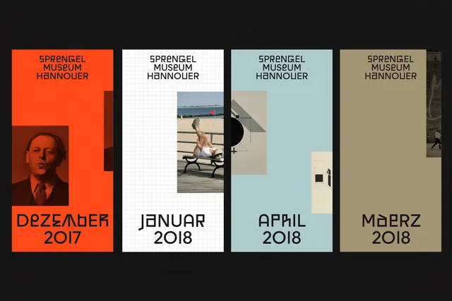
Four modular poster designs for a German art museum using stark color-blocking, grid-based layouts, and photographic elements to signal distinct exhibitions across a cohesive identity system.
Summary
A four-poster series for Sprengel Museum that uses modular color-blocking, consistent sans-serif typography, and centered layouts to create a unified institutional identity across individual exhibitions.
Visual description
Four vertical posters displayed in a grid, each 4 inches wide and roughly 6 inches tall. Poster 1 (December 2017): burnt orange ground with a darker reddish-brown portrait photo in the lower left and large black sans-serif type at top and bottom. Poster 2 (January 2018): white background with a light gray grid pattern, a centered vertical photograph of a person on a bench, and black typographic elements anchoring top and bottom. Poster 3 (April 2018): soft blue-gray background with beige and gray geometric shapes (rectangles and a black circle), minimalist sans-serif at top. Poster 4 (March 2018): warm tan-brown ground with a small photographic element in the upper right corner and black type anchoring the layout. All four share the "SPRENGEL MUSEUM HANNOVER" masthead in a geometric sans-serif, month and year beneath in matching type, and a spare, highly structured approach to negative space.
Key takeaway
The systematic use of a single background color per poster to signal different exhibitions while maintaining typographic consistency. The centered, all-caps museum name as a structural anchor above the variable composition below. The discipline of aligning photography or geometric shapes within a contained area, letting the field color carry the design.
Reuse notes
Ideal for institutional identity systems where a single typeface and modular color system need to distinguish multiple offerings (galleries, events, product lines). Works well for poster series, exhibition catalogs, or any multi-part communication where visual consistency matters more than novelty. The geometric shapes in posters 3 and 4 suggest a secondary graphic language for decoration or information hierarchy.
More like this
Keep what you find
A free account saves references to boards and can send you a weekly email of picks based on what you save.
To see every result, go Pro.