Preview image. Unlock full-res
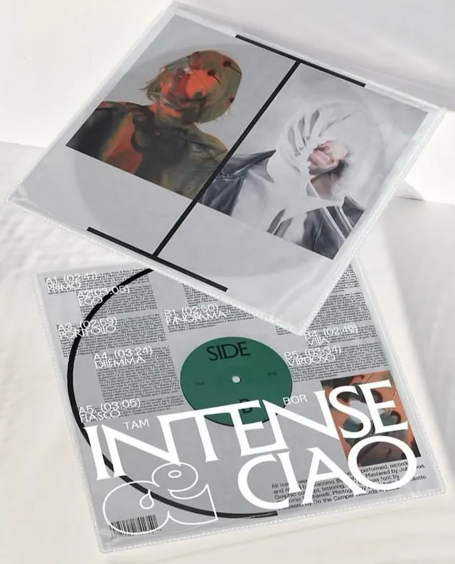
Album or music release cover combining raw portrait photography in warm and cool tones with distressed sans-serif typography overlaid on a vinyl record graphic.
Summary
Album or music release cover combining raw portrait photography in warm and cool color separations with distressed sans-serif typography overlaid on a vinyl record graphic.
Visual description
A flat-lay composition shows a clear plastic sleeve containing two printed elements: an upper photograph printed with color separation technique (two portraits, one warm/reddish cast and one cool/monochromatic in grays and whites with a pale pink subject), and a lower piece of printed material showing large bold sans-serif type spelling out key words overlaid atop a vinyl record illustration. The vinyl sits at an angle with a black line extending from its edge. Small track-listing text is visible in the background, rendered in small caps. The overall aesthetic is deliberately rough and documentary-like, with the distressed type giving the impression of hand-drawn or roughly printed letterforms. The composition emphasizes the contrast between the organic shapes of human faces and the rigid geometry of typography and record graphics.
Key takeaway
The color-separation technique applied to photography creates a raw, editorial quality that feels both intentional and handmade. Layering bold display type directly over a vinyl or object illustration (rather than just floating it) gives the typographic element structural weight. The flat-lay presentation of printed materials in a transparent sleeve reads as authentic and tangible, ideal for music or artist branding.
Reuse notes
Effective for music releases, artist portfolios, or any media brand seeking an intentionally rough, documentary aesthetic. Works best when paired with a specific artist or label identity; the rawness can feel unfocused without a clear subject. The color-separation portraits will need real photography; this technique pairs poorly with digital filters or overly polished imagery.
More like this

Keep what you find
A free account saves references to boards and can send you a weekly email of picks based on what you save.
To see every result, go Pro.