Preview image. Unlock full-res
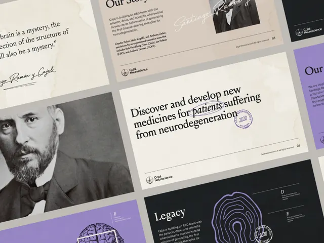
A multi-panel editorial spread combining black-and-white portraiture, type specimens, and layout variation across grid-aligned pages.
Summary
An editorial spread across 4 pages balancing portrait photography, display typography, and structured text blocks in a strict grid system.
Visual description
The composition spans multiple pages arranged in a 2x2 grid. Alternating left and right pages feature black-and-white portrait photography, each occupying roughly one-third of the page height. Page elements include typographic specimens set in display and body sans-serif, printed text blocks introducing a person or concept, and ruled lines creating visual structure. Color is restricted to black, white, and neutral grey; one page introduces a soft indigo accent. Generous margins and white space surround each element, emphasizing restraint. A small monogram or logo mark appears consistently as a signature.
Key takeaway
The paired rhythm of photography + text (not image-heavy, but image-anchored). The restraint in type choices (one display, one body family). How the grid and white space make hierarchy feel inevitable rather than designed.
Reuse notes
Strong template for annual reports, cultural institution materials, and editorial identities. Works best with access to compelling portraiture. Requires careful typesetting to justify the whitespace.
More like this





Keep what you find
A free account saves references to boards and can send you a weekly email of picks based on what you save.
To see every result, go Pro.