Preview image. Unlock full-res
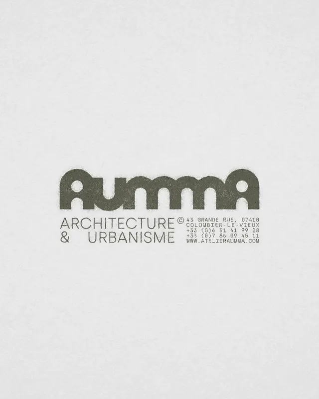
An architecture and urbanism firm brand featuring a tight geometric wordmark with interlocking circular and rectangular forms suggesting building blocks and spatial planning.
Summary
An architecture and urbanism firm brand featuring a tight geometric wordmark with interlocking circular and rectangular forms that suggest building blocks and spatial planning, paired with centered contact details in condensed sans-serif.
Visual description
A centered composition on light gray background. The wordmark IMMA uses three overlapping circular forms at its core, with modular rectangular shapes anchoring the word length. The letterforms are constructed from geometric primitives, creating a vocabulary that reads as both architectural and contemporary. Below: "ARCHITECTURE & URBANISME" in smaller condensed sans-serif, then full contact address (Paris-based, Coloumbier-le-Vieux) and website (atelier-imma.com) in the same austere typeface. All text is rendered in a muted sage-gray, reinforcing restraint and professional minimalism.
Key takeaway
The geometric abstraction of the letterforms using overlapping circles and rectangles is instantly recognizable and reinforces the architectural mandate without being literal. The extreme whitespace around a centered composition conveys confidence and allows the mark to breathe. Using a single monochromatic palette unifies the mark, secondary text, and background into one cohesive statement.
Reuse notes
Ideal for professional services, architecture, design consultancy, and urban planning firms. The restrained approach works best when your audience values intelligence and refinement over approachability. The geometric construction makes it highly scalable and legible even when small. Not suited for industries requiring warmth or playfulness.
More like this


Keep what you find
A free account saves references to boards and can send you a weekly email of picks based on what you save.
To see every result, go Pro.