Preview image. Unlock full-res
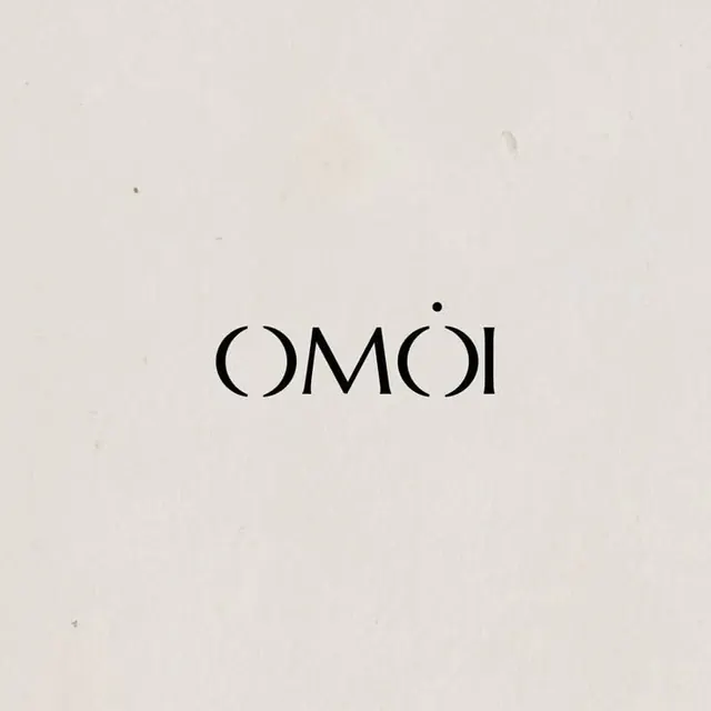
A brand wordmark spelling 'COMOI' in tall, open geometric sans-serif capitals with a centered dot accent.
Summary
A brand wordmark spelling 'COMOI' in tall, open geometric sans-serif capitals with a centered dot accent above the text.
Visual description
Five capital letters spelling COMOI in a tall, extended sans-serif with generous letterspace and visibly geometric construction (circular curves, linear strokes with consistent weight). A single solid dot sits centered above the text, creating a visual anchor. The background is warm off-white to light beige. The type is solid dark gray to black, neutral and legible. No illustration or additional marks. Very spare composition with significant white space surrounding the wordmark.
Key takeaway
The use of a single geometric accent (the dot) to anchor and complete a minimalist wordmark without requiring a separate logo. The tall, open letterforms with clear geometric construction convey clarity and modern intent. Generous letter-spacing keeps the mark feeling contemporary and uncluttered.
Reuse notes
Strong model for luxury or minimal fashion, architecture, or design-led brands. The approach works best when the typeface itself is distinctive enough to anchor the identity without a separate symbol. The dot accent is effective for brand marks that need a secondary touch but want to avoid a full icon.
More like this




Keep what you find
A free account saves references to boards and can send you a weekly email of picks based on what you save.
To see every result, go Pro.