Preview image. Unlock full-res
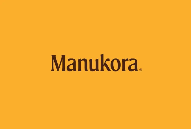
A premium honey brand wordmark rendered in bold dark serif type centered on a warm, solid golden-yellow background to evoke natural sweetness and artisanal authenticity.
Summary
A premium honey brand (Manukora) presented as centered dark-brown serif wordmark on a warm golden-mustard background, using color alone to convey natural origin and crafted positioning.
Visual description
A golden-yellow background (approximately Pantone 123 C or hex #FCAF2D) fills the entire composition. Centered at mid-height sits the word "Manukora" in a strong serif typeface, rendered in a deep warm brown (approximately hex #431F12), with a registered trademark symbol following the final 'a'. The word is large, roughly 150-180pt, and set with generous letterspacing. No other elements, patterns, texture, or photography appear. The composition is purely typographic, relying on the warmth of the background and the weight/color contrast of the serif to carry meaning.
Key takeaway
The color pairing alone does nearly all the work: golden-yellow reads as honey, warmth, natural sweetness; dark brown reads as richness and earthy origin. A single, well-chosen serif typeface in display scale can anchor premium positioning. The centered, minimal approach signals confidence and heritage (classic packaging for established brands).
Reuse notes
Exceptionally strong for food, beverage, and artisanal goods where authenticity and premium positioning matter more than novelty. The solid background approach works best at large scale (packaging, signage, digital landing pages) where the color impact is visceral. Serif type should be warm-toned and substantial in weight; thin or cold serifs will undermine the craft signal. This approach leaves room for detailed secondary information, ingredients, or provenance claims elsewhere on packaging.
More like this



Keep what you find
A free account saves references to boards and can send you a weekly email of picks based on what you save.
To see every result, go Pro.