Preview image. Unlock full-res
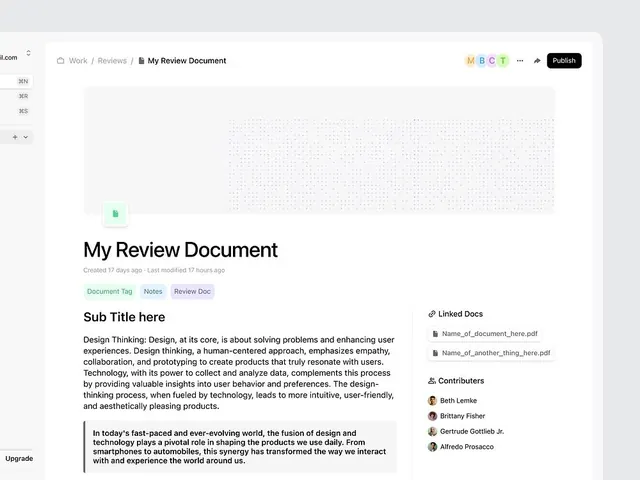
Minimal collaboration interface for document review, using generous white space and a single green accent icon on a clean hierarchy.
Summary
A minimal collaborative document interface emphasizing readability through generous white space and a single green accent highlighting the primary action icon.
Visual description
Left sidebar with folded navigation and section labels (JEN, JER, JES). Main content area shows "My Review Document" with a document icon in pale green, creation date and modification timestamp, and three small tag pills (Document Tag, Notes, Review Doc). The large central region displays a "Sub Title here" followed by a justified paragraph about design thinking. A pull-quote in left-aligned sans-serif sits below, with a "Linked Docs" section on the right listing PDF attachments and contributor avatars. The entire layout is anchored in white with subtle gray accents and a dotted texture gradient in the upper region.
Key takeaway
The discipline of one color (green) as the sole attention-getter; the effective use of tags and metadata without clutter; the balanced sidebar-plus-content structure that scales to accommodate complexity while preserving scanability.
Reuse notes
Strong default for productivity tools, document management, or team collaboration platforms. The sidebar nav works well for projects with multiple sections. Best paired with high-quality typography and ample gutters to avoid overwhelming users. Avoid in marketing or consumer contexts where warmth or personality matters more than efficiency.
More like this
Keep what you find
A free account saves references to boards and can send you a weekly email of picks based on what you save.
To see every result, go Pro.