Preview image. Unlock full-res
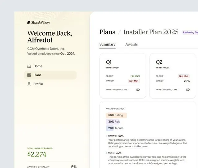
Two-panel SaaS dashboard showing employee onboarding and quarterly performance metrics in a muted neutral palette.
Summary
A SaaS dashboard interface for employee earnings and installer-plan metrics, split between a welcoming left sidebar and a detailed right panel showing quarterly performance thresholds and award calculations.
Visual description
The left panel displays a warm beige background with a "ShareWillow" logo, a personalized greeting ("Welcome Back, Alfredo!"), company name and employee tenure, and a simple three-item navigation (Home, Plans, Profile). The right panel on white shows a "Plans / Installer Plan 2025" header with a Summary/Awards tab toggle, two metric cards for Q1 and Q2 displaying threshold, profit, margin, and status (red text for "Not Met"), a section for award-formula breakdown (50% Rating, 30% Role, 20% Tenure), and large numeric displays for total awards earned ($2,274) and award-as-salary percentage (5%). Typography is minimal, and color accent is reserved for status indicators and the sidebar beige.
Key takeaway
The clean two-column layout separating personalization (left) from data (right), allowing the UI to be warm and welcoming without cluttering the metric display. The use of neutral palette with minimal accent color makes the data hierarchy clear. Status indicators in red draw attention without brightness. The award-formula callout section teaches the user the calculation model directly in the interface.
Reuse notes
Effective for fintech, HR, or payments SaaS where employees or contractors need to understand earnings, thresholds, and formulas. The beige sidebar humanizes an otherwise clinical dashboard. Works best when the data being displayed is specific and numeric (not prose-heavy). The tabbed secondary navigation (Summary/Awards) suggests more features without overwhelming the primary view.
More like this



Keep what you find
A free account saves references to boards and can send you a weekly email of picks based on what you save.
To see every result, go Pro.