Preview image. Unlock full-res
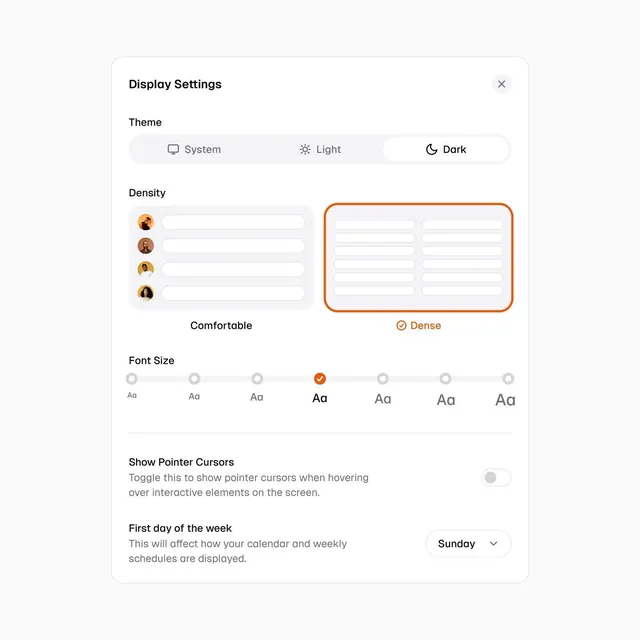
Display settings modal showing theme toggles, density slider with circular avatar previews, font-size range selector, and secondary toggles in a light, airy dialog.
Summary
Preferences modal offering theme selection (System, Light, Dark), layout density slider with live avatar-circle previews showing how tight/loose the UI reflows, a 7-step font-size scale with orange indicator, and secondary toggles for pointer cursors and week-start preference.
Visual description
Clean white modal on light gray background with rounded corners. Header shows "Display Settings" with close button. Three main control groups: Theme (System/Light/Dark pill toggles), Density (vertical slider flanked by four circular avatar previews on left showing increasing visual density, right panel preview grid bordered in orange showing "Dense" setting), and Font Size (seven-point scale with icon sizes from Aa to Aa, middle step marked with orange checkmark). Below are two secondary toggles: "Show Pointer Cursors" (with explanatory text) and "First day of the week" (dropdown showing "Sunday"). All text in clean gray sans-serif, orange used for active state.
Key takeaway
The density slider paired with live preview circles showing how the layout reflows. The visual representation of abstract settings (density, theme) without verbose explanation. The orange accent color for interaction feedback without overwhelming the neutral palette.
Reuse notes
Ideal for productivity or system settings interfaces. The avatar preview pattern communicates density effectively without text. Orange as accent color works best against light backgrounds. Works equally for desktop and mobile apps where settings depth/spacing matters.
More like this

Keep what you find
A free account saves references to boards and can send you a weekly email of picks based on what you save.
To see every result, go Pro.