Preview image. Unlock full-res
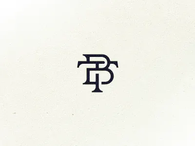
A navy geometric monogram combining interlocking letterforms in a square-proportioned, architectural mark suitable for luxury branding.
Summary
A navy interlocking monogram constructed from geometric letterforms with uniform stroke weight, centered on a textured cream background.
Visual description
Centered composition on a light cream-off-white background with a subtle paper-like texture. Monogram features three interlocking letters (appears to be a stylized 3-letter mark) in navy blue (#2B2D36 or similar). The letters interlock at corners and strokes with precise geometric construction. Each letterform shares equal weight and proportion, creating a balanced, square-footprint mark. The stroke thickness is uniform throughout, and the letters stack and overlap to form a compact, self-contained symbol without any baseline or framing border.
Key takeaway
The interlocking technique: overlapping letterforms without thick outlines or containers keeps the mark refined and modern. Geometric construction and uniform stroke weight convey precision and craftsmanship. The neutral, textured background elevates the mark without competing for attention. This approach works equally well scaled up (business card, signage) or scaled down (favicon, app icon).
Reuse notes
A strong reference for luxury, fashion, finance, or professional-services branding where understated sophistication is the goal. Works well in monochromatic applications and scales cleanly across media. The textured background is optional; the mark will stand alone well on white or colored grounds. Best applied to contexts where the brand is established enough to stand on a symbol alone (no wordmark required).
More like this



Keep what you find
A free account saves references to boards and can send you a weekly email of picks based on what you save.
To see every result, go Pro.