Preview image. Unlock full-res
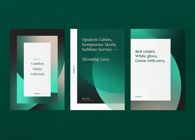
Three minimalist card designs on a deep emerald-green ground, using layered cream and teal rectangles, serif and sans-serif typography, and negative space to evoke premium hospitality.
Summary
Three card mockups layered on a deep teal-green field, using stacked cream and pale teal rectangles with serif and sans-serif type to convey quiet luxury and refined restraint.
Visual description
Three vertical card or panel compositions are arranged side-by-side on a saturated deep-emerald background. Each card uses overlapping rectangular shapes in cream, off-white, and pale teal-green, offset slightly to create depth and shadow. The leftmost card has a cream rectangle with a small serif "Logo" mark inside, overlaid with a darker charcoal element. The center card displays serif typography in all-caps (type name unclear in thumbnail). The rightmost card mirrors the left with cream field and charcoal accent. Typography is minimal and intentional, using serif faces for emphasis. The composition relies on geometric layering, negative space, and a restricted cool palette (emerald + teal + cream + charcoal) to achieve a sense of exclusivity and premium craftsmanship.
Key takeaway
The use of background color (deep emerald) as the primary visual anchor, with cards and overlays receding into it. Offset rectangular shapes stacked without alignment to create visual tension and depth without movement. Restraint in typography: one statement element per card, serif for prestige.
Reuse notes
Ideal for luxury brands in hospitality, fine jewelry, high-end retail, or exclusive clubs. Works best when the brand's actual color is a deep jewel tone; the palette is tightly controlled (no more than 2-3 accent colors). Not suitable for high-volume or playful brands; the calm, refined mood requires slow-moving content.
More like this



Keep what you find
A free account saves references to boards and can send you a weekly email of picks based on what you save.
To see every result, go Pro.