Preview image. Unlock full-res
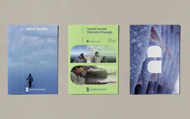
Three bound report covers for Arctic environmental projects: blue, green, and indigo, each with stacked photography and minimal sans-serif type.
Summary
Three minimalist report covers for environmental projects, each with a distinct complementary color (blue, green, indigo) and stacked full-bleed photography with white sans-serif typography overlaid.
Visual description
Three bound covers arranged side by side showcase a cohesive branding system. The left cover is light blue with a solo winter/water landscape and small figures. The center cover is vibrant lime-green with two stacked photographs (people outdoors, landscape below) and rounded photo masks. The right cover is deep indigo-blue with a frost-textured or icy surface and white geometric negative-space cutouts creating abstract shapes. All three use clean, modern sans-serif type in white positioned over or beside the photography. Shared branding elements include "ArctiConnexion" and "Project Development & Mentorship" messaging. The typography is legible and minimal, never competing with the imagery.
Key takeaway
A three-color complementary palette (cool blues and cool greens) that establishes visual variety while maintaining harmony. Stacked photography at full-bleed with white type positioned for readability. Die-cut or negative-space shapes on the right cover add tactile, physical design interest.
Reuse notes
Strong for environmental nonprofit, educational, or scientific report packaging. The stacked-photo pattern works well when multiple concepts or geographies need equal visual weight. Best with photography that has clear focal points. The right cover's abstract cutout pattern requires thoughtful fabrication planning.
More like this



Keep what you find
A free account saves references to boards and can send you a weekly email of picks based on what you save.
To see every result, go Pro.