Preview image. Unlock full-res
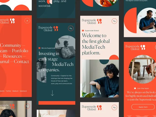
A media-tech startup website showcasing interlocking card panels in burnt-orange and dark teal with centered photography, nested headings, and a modular layout.
Summary
A media-tech startup website grid showcasing nested card panels in burnt-orange and dark teal with centered photography, bold sans-serif headlines, and modular responsive layout.
Visual description
Three vertical panels showing responsive website layouts. Left panel: burnt-orange background with white type listing navigation (Community, Team, Portfolio, Resources, Journal, Contact) and a photo cropped into a circle. Center panels: dark teal-gray backgrounds with photography framed in circular crops, structured text hierarchy with a main headline "Welcome to the first global MediaTech platform" and supporting body copy, small menu icons top-right. Right panel: burnt-orange with a circular photo, a headline, and a call-to-action button with outlined style. All sections use flush-left alignment, generous whitespace, and thin sans-serif typography for contrast against color-blocked backgrounds.
Key takeaway
The modular card stack approach with oversized circular image frames anchoring each section. The warm-cool color opposition (burnt-orange against teal-gray) creates visual separation without needing borders. Pairing a display-weight headline with minimal supporting copy and one clean CTA per card keeps focus tight.
Reuse notes
Strong for media, publishing, or startup websites where portfolio photography is a hero element. Works well when you need distinct sections (team, mission, services) to live at equal visual weight. The burnt-orange and teal palette reads sophisticated and energetic at once; avoid if softer branding is needed.
More like this
Keep what you find
A free account saves references to boards and can send you a weekly email of picks based on what you save.
To see every result, go Pro.