Preview image. Unlock full-res
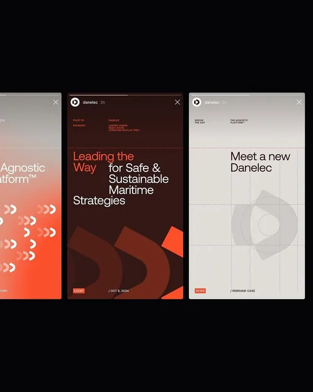
A three-card app interface system combining coral-to-white gradients, deep burgundy accents, and clean sans-serif typography for a maritime tech brand.
Summary
Three mobile-style card designs for Danelec stacked horizontally, using contrasting color zones and structured typography to present event, product, and news information with clear visual hierarchy.
Visual description
Left card: vertical gradient from coral-orange at the bottom to white at the top, with small repeated white chevron icons suggesting forward motion. Center card: dark burgundy background with copper-orange accent shapes in the lower corner, white serif headline "Leading the Way" with sans-serif body copy, event metadata at bottom. Right card: light gray-white card with centered headline "Meet a new Danelec", circular dotted diagram in center zone, minimal supporting text. All three cards have close button (X) and brand logo in the header, linked metadata at bottom (event date, rebrand case), creating a cohesive system despite the color variance.
Key takeaway
The three-card gradient system creates visual variety while staying unified: each card solves a different information problem (narrative, feature, identity) with distinct color but shared type scale and spacing. The copper-orange accent shape in the center card anchors the warm palette without overwhelming the typography. Small interactive details (chevrons, dotted diagram) add texture without clutter.
Reuse notes
Works well for B2B SaaS product updates, events, or news rollups that need visual variety but semantic consistency. The warm-to-cool color language suggests premium or fintech brands. Best in a 3-up horizontal layout on desktop, stackable on mobile. Caution: dense information on dark burgundy reduces readability; pair with generous leading.
More like this






Keep what you find
A free account saves references to boards and can send you a weekly email of picks based on what you save.
To see every result, go Pro.