Preview image. Unlock full-res
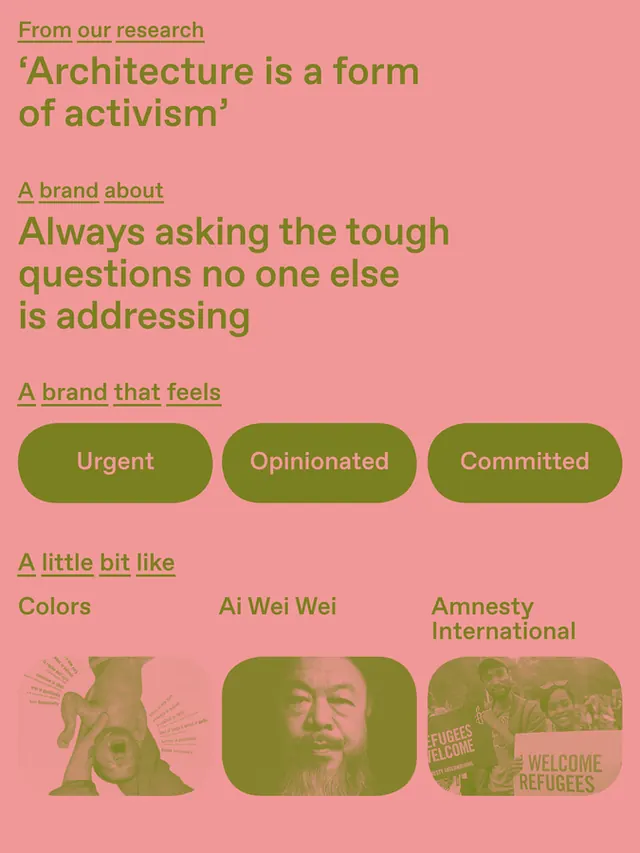
Activist organization brand guide featuring bold typography, research claims, and a grid of diverse imagery (people, patterns, logos) on a coral-pink background.
Summary
A brand identity guide for an activist organization, combining research statements with bold typography, three rounded-pill callout badges, and a footer grid of portrait and partner-logo imagery.
Visual description
Coral-pink background with structured text hierarchy. Top section reads "From our research" in green-gold caps, followed by a large-scale serif quote: "Architecture is a form of activism." Below, "A brand about" introduces "Always asking the tough questions no one else is addressing" in olive-green sans-serif. Another section, "A brand that feels," displays three rounded-pill badges: "Urgent," "Opinionated," and "Committed" in white text on olive-green grounds. Bottom section "A little bit like" presents five tiles: a patterned illustration (pink/green geometric), a portrait photograph, and logos/imagery for "Ai Wei Wei," "Amnesty International," and related organizations. Typography is a bold mix of serif display type and sans-serif body copy.
Key takeaway
The integration of research claims as a brand foundation; the semantic use of rounded-pill badges to communicate brand personality; and the diverse visual grid (photography, patterns, logos) showing real-world application and social partnerships.
Reuse notes
Effective for nonprofits, advocacy organizations, and mission-driven brands where transparency and bold values matter. The coral-pink palette is distinctive and warm; combine with deeper olive-greens for authority. Works well in brand guidelines, impact reports, and social campaigns where human diversity and social proof are central.
More like this



Keep what you find
A free account saves references to boards and can send you a weekly email of picks based on what you save.
To see every result, go Pro.