Preview image. Unlock full-res
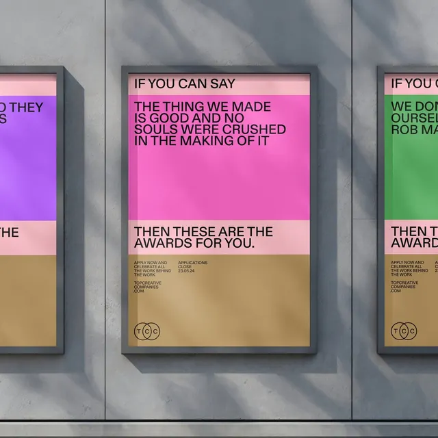
A mounted poster installation series with bold philosophical typography and tripartite color blocking in vibrant magenta, lime green, and tan on industrial concrete.
Summary
Mounted poster series on weathered concrete wall using vibrant neon color-blocking and assertive black sans-serif type to promote design awards, with provocative philosophical copy about creative integrity.
Visual description
Three printed posters mounted flush against a rough gray concrete wall. Each poster employs an identical tripartite vertical structure: vibrant full-height color block (magenta, lime green, and violet across the three examples), narrow pale pastel band (pale pink/peach), and tan/ochre base section. Bold uppercase sans-serif text (likely Helvetica or similar grotesque family) in black occupies the upper neon-colored zone with statements like "IF YOU CAN SAY THE THING WE MADE IS GOOD AND NO SOULS WERE CRUSHED IN THE MAKING OF IT" and "THEN THESE ARE THE AWARDS FOR YOU." Smaller body text and circular logo mark appear in the tan base. Overlapping shadows from adjacent walls add depth and dimensional presence.
Key takeaway
Tripartite color-blocking creates immediate visual tension and hierarchy without requiring multiple typefaces. Neon colors against modest tan/ochre base prevents oversaturation. The broken, philosophical messaging demands reading and engagement, turning the poster into a conversation piece rather than passive decoration.
Reuse notes
Compelling for cultural institutions, awards campaigns, design or creative-industry promotion, or any context where confrontational messaging serves the message. The Swiss grid approach maintains legibility despite bold color choices. Best suited to large-format print and environmental installations where scale enhances impact. The philosophy-as-copy approach works strongest for cause-driven or aspirational brands.
More like this






Keep what you find
A free account saves references to boards and can send you a weekly email of picks based on what you save.
To see every result, go Pro.