Preview image. Unlock full-res
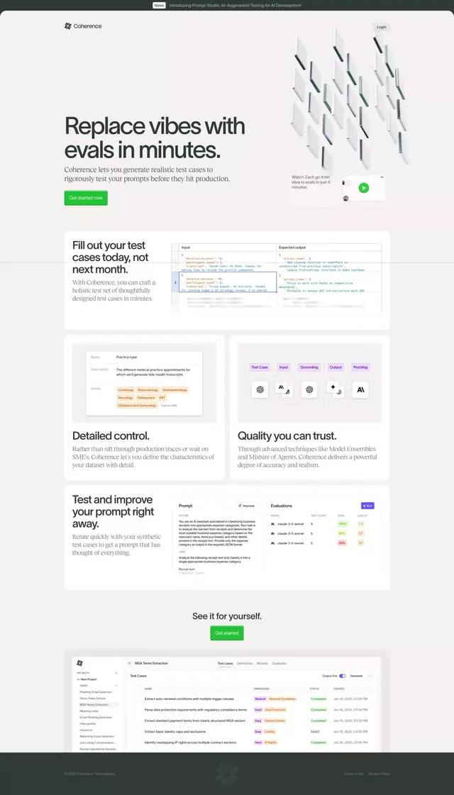
SaaS landing page for AI-augmented test case generation, mixing 3D isometric icons with a vertical layout and bold green CTA buttons.
Summary
Landing page for Coherence, an AI test case generation platform, combining minimalist layout with 3D visual elements and bright action buttons to convey modern developer tooling.
Visual description
Long-form SaaS landing page with a top hero section showing an oversized headline ("Replace vibes with evals in minutes"), a teal 3D isometric graphic of stacked cards or data blocks animating to the right, a green "Get started now" button, and a video play indicator. Below, a four-column grid of feature sections, each with a dark headline, supporting copy, and visual element: code snippets with colored syntax highlighting, a practice-type selector card listing medical categories, a dashboard showing test case evaluations with color-coded status badges (green for passing, red for failing), and an icon grid of six testing-related symbols. Footer shows a sidebar navigation and a data table snippet labeled "MSA Terms Extraction" with multiple trigger rules and status indicators.
Key takeaway
The hero's combination of clear value proposition plus a floating 3D illustration rather than a screenshot. The color-coded evaluation table using red/green status badges for quick visual scanning. A methodical four-column section grid that anchors each feature to both copy and a micro-component (card, table, icon set) rather than full screenshots.
Reuse notes
Pattern works well for developer tools, testing platforms, and workflow automation SaaS. The oversized headline with pared-back intro copy appeals to engineering buyers. Isometric graphics soften an otherwise technical layout; suitable when the product itself is code-heavy.
More like this

Keep what you find
A free account saves references to boards and can send you a weekly email of picks based on what you save.
To see every result, go Pro.