Preview image. Unlock full-res
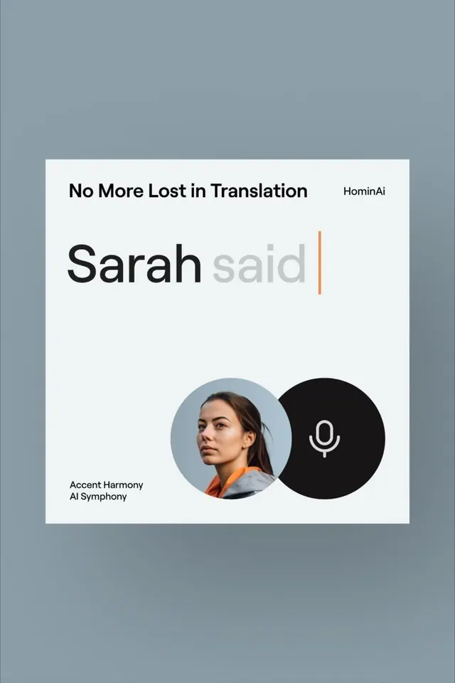
Clean minimalist card showcasing a voice-based translation app with overlapping circular imagery (portrait and microphone icon) and accent color hierarchy.
Summary
Minimalist product card for a voice translation app, using overlapping circular imagery and a single warm accent color to signal interactivity within a neutral palette.
Visual description
A white card sits on a muted blue-gray background. Top line reads "No More Lost in Translation" with "HominAi" aligned right in small type. The headline "Sarah said" appears in large bold sans-serif, with the word "said" repeated behind in lighter gray. An orange-rust vertical bar punctuates the right edge of the text block, drawing the eye downward. Below, two circles overlap: a light blue circular frame holds a portrait photo of a woman, slightly offset. A solid black circle sits to its right with a centered white microphone icon, representing the voice interaction layer. Bottom left reads "Accent Harmony AI Symphony" in small sans-serif. Color palette: cream, slate, black, with one warm accent.
Key takeaway
Overlapping circles create instant spatial depth without layering complexity; the photo circle feels tactile while the icon circle feels actionable. A single warm accent (orange) breaks the monochrome palette and guides focus downward. Hierarchy is tight: headline, accent bar, visual elements, footer. No decoration beyond these functional moves.
Reuse notes
Excellent for accessibility tools, language apps, or voice-interface products. The overlapping circles work best when one contains human imagery (portrait, smile, expression) and one contains a simple icon (microphone, speaker, etc.). The accent color should contrast sharply with the background to signal interaction. Fits portrait or square formats. Scale down to mobile well because the white card, circular elements, and large type remain legible at small sizes.
More like this



Keep what you find
A free account saves references to boards and can send you a weekly email of picks based on what you save.
To see every result, go Pro.