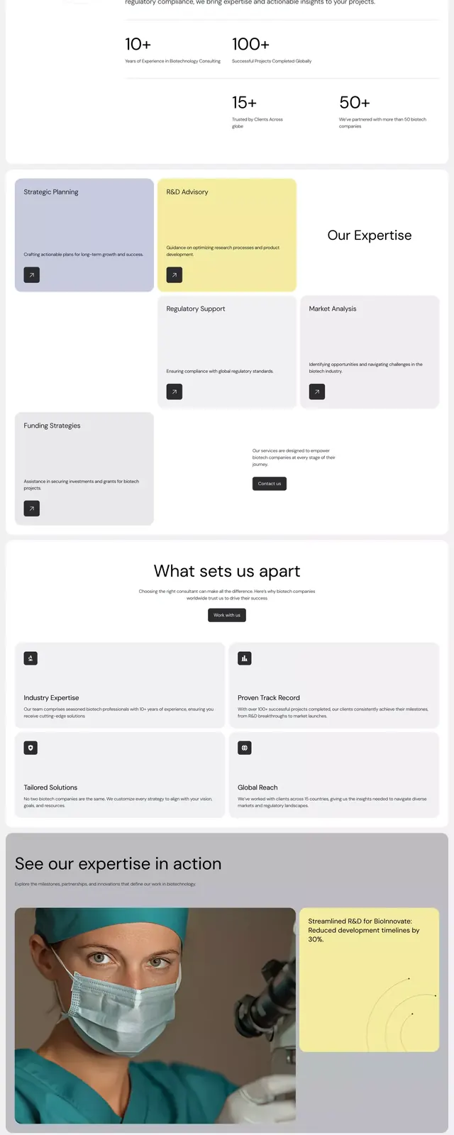
Preview image. Unlock full-res
Genovas healthcare brand identity showing logo treatment, color palette, and layout principles on a cohesive brand page.
Summary
A brand identity system overview for Genovas healthcare, unfolding logo lockups, color palette swatches, typography pairings, and application guidelines in a clean modular grid.
Visual description
A vertical brand presentation sequence opens with the Genovas logotype in sans-serif across a neutral tan and gray palette. Below, color swatches and tonal variations, followed by section dividers using the brand's accent warm terracotta against ivory and gray. The layout uses a consistent grid structure with ample whitespace, set-up text blocks, and photo callouts showing real-world application. A portrait photograph of diverse team members appears halfway through. The entire system exhibits restraint: no decorative elements, monochrome accent accents, sans-serif all-caps labels, and a clear hierarchy built through scale and spacing alone.
Key takeaway
The modular grid presentation itself, breaking identity rules into discrete sections (logo, color, type, layout, examples). The use of a single warm accent color for hierarchy and visual breathing room across a neutral foundation. The inclusion of real-world application photos to ground abstract rules in practice.
Reuse notes
Strong template for healthcare, fintech, or B2B brand guidelines. The minimalist palette and grid approach works well for creating a sense of order and trustworthiness. Pairing opportunity: use similar sparse layouts for compliance-heavy or data-driven brands. This approach scales well to print and digital both.
More like this


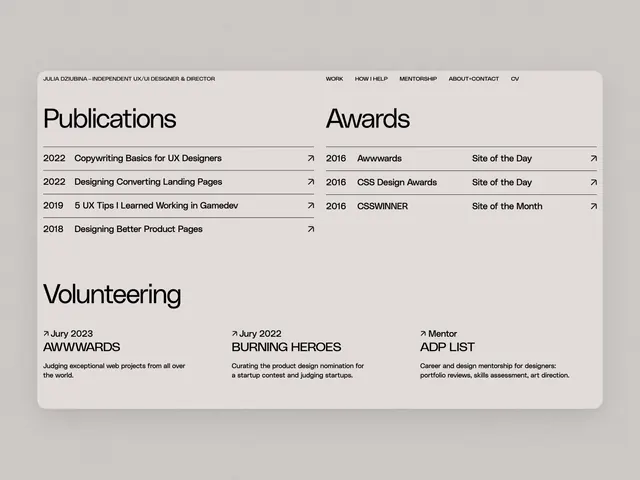

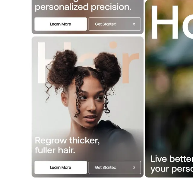
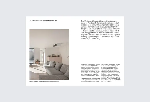


Keep what you find
A free account saves references to boards and can send you a weekly email of picks based on what you save.
To see every result, go Pro.