Preview image. Unlock full-res
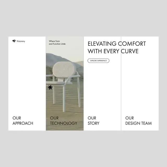
Four-column layout dividing sections labeled Visionary, Approach, Technology, Story, and Design Team, with a mountain landscape and cream-cushioned chair featured in the Technology column.
Summary
Four-column layout dividing sections labeled Visionary, Approach, Technology, Story, and Design Team, with a mountain landscape and cream-cushioned chair featured in the Technology column.
Visual description
Four vertical panels separated by light gray dividers on a light gray background. Far left panel is nearly blank, labeled "OUR APPROACH" in serif type at the base. Second panel shows a mountain lake scene with a cream curved-back chair in the foreground, labeled "OUR TECHNOLOGY" in serif type. Third panel is white with the headline "ELEVATING COMFORT WITH EVERY CURVE" in tall, tight sans-serif capitals, and an outlined pill button reading "EXPLORE EXPERIENCE" centered below. Fourth panel is white, labeled "OUR DESIGN TEAM" in serif type. A small cursor icon appears in the second panel. Navigation sections are anchored at panel tops in condensed sans-serif: "Visionary," "Where Form and Function Unite," and others.
Key takeaway
The modular grid creates clear information hierarchy while maintaining visual calm through uniform column widths and muted color. The single product photograph (chair) breaks the white-space pattern just enough to be a focal point without disrupting the serene layout. The mix of serif (section labels) and sans-serif (navigation, headline) adds subtle sophistication.
Reuse notes
Strong template for furniture, interior, or architecture websites that need to present philosophy alongside products. The landscape photography grounds the brand in tactile, natural contexts. White-space dominance requires confident headline writing; this works best when your headline is bold and concise.
More like this




Keep what you find
A free account saves references to boards and can send you a weekly email of picks based on what you save.
To see every result, go Pro.