Preview image. Unlock full-res
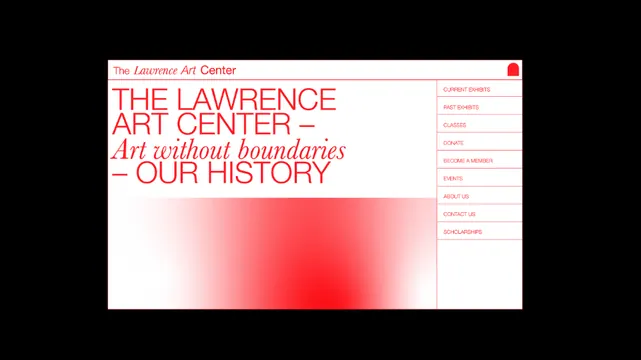
Website hero with bold red sans-serif headline, italic tagline, and radial gradient accent shape.
Summary
Website hero for Lawrence Art Center with bold red sans-serif headline, italic tagline, and a soft radial gradient shape anchoring the right side.
Visual description
White background with a narrow top bar identifying "The Lawrence Art Center" in red. Main headline in large black sans-serif caps ("THE LAWRENCE ART CENTER") sits above an italic tagline in matching red ("Art without boundaries - OUR HISTORY"). Below the headline sits a soft radial gradient that transitions from pale pink to vivid red, creating an organic focal point on the right side of the layout. A vertical navigation sidebar in the far right contains right-aligned menu items in red sans-serif caps: Current Exhibits, Past Exhibits, Classes, Donate, Become a Member, Events, About Us, Contact Us, Scholarships.
Key takeaway
The radial gradient as a breathing accent that organizes space without a hard container. The two-tone typography approach (black headline + red accents) for clear hierarchy on a neutral background. The navigation sidebar approach keeps the layout open while containing utility links.
Reuse notes
Works well for cultural institutions, nonprofits, or educational sites needing to balance visual interest with clarity. The gradient is subtle enough not to compete with type but impactful enough to guide the eye. Sidebar navigation suits portrait-oriented pages with moderate menu depth.
More like this




Keep what you find
A free account saves references to boards and can send you a weekly email of picks based on what you save.
To see every result, go Pro.