Preview image. Unlock full-res
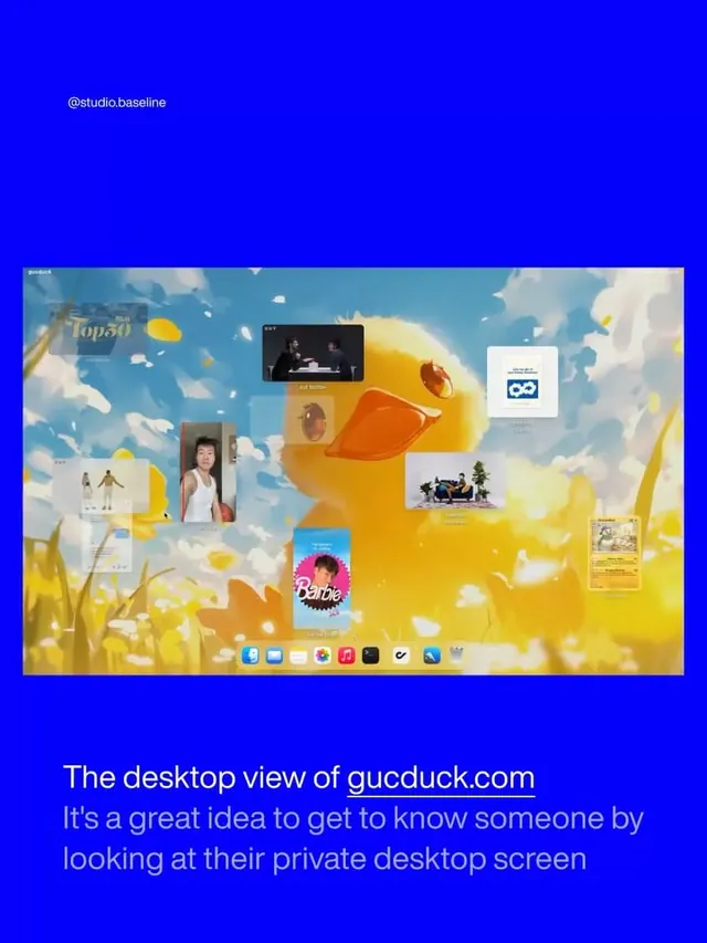
Personal branding collage of a digital desktop screenshot framed by cobalt blue, featuring scattered UI elements and lifestyle imagery.
Summary
Personal branding collage of a digital desktop screenshot framed by cobalt blue, featuring scattered UI elements and lifestyle imagery.
Visual description
A large cobalt-blue frame borders a bright yellow desktop mockup. Inside: scattered rectangular cards and windows float across a yellow background punctuated with cream-white shapes. Visible elements include a small video player window (top center, showing two people), a Barbie card (bright blue background, center-left), photo frames with personal imagery, calendar interface, circular app icons in a dock at bottom (blue, red, yellow, black), and decorative rounded shapes. Top-left text reads "@studio.baseline" in white. Lower text states "The desktop view of gucduck.com" with tagline "It's a great idea to get to know someone by looking at their private desktop screen". The overall effect is playful and intentionally informal, like a digital mood board or personal brand statement. Color palette moves from saturated cobalt-to-yellow core with muted cream and tan accents.
Key takeaway
The framing technique: using a bold solid color border (cobalt) to contain a layered, busy interior. This creates focus without needing hierarchy or grid. The scattered card/window composition (not aligned to grid) reads as curated but organic, less rigid than traditional portfolio layouts. The mix of UI elements, photography, and abstract shapes allows multiple content types without visual conflict. The text overlay that explains the concept rather than selling it.
Reuse notes
Strong approach for personal brand and studio websites seeking to convey personality and process rather than polish alone. Works well for digital-first brands, design studios, and portfolios that want to stand out. The bright yellow pairs effectively with cobalt blue for tech and creative sectors. Beware: the scattered composition can feel chaotic if not carefully spaced and colored; the background color should be significantly more saturated than the floated elements to maintain readability.
More like this


Keep what you find
A free account saves references to boards and can send you a weekly email of picks based on what you save.
To see every result, go Pro.