Preview image. Unlock full-res
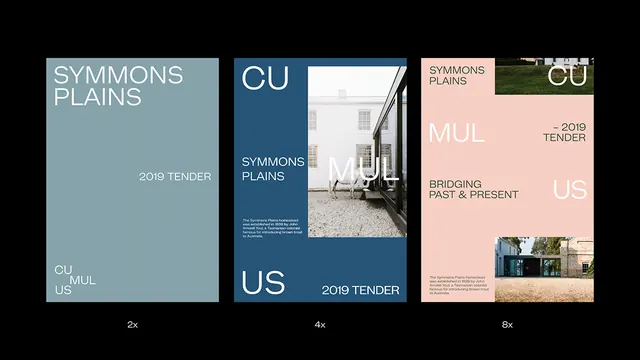
Minimalist architectural identity using split-panel layouts with teal, navy, and rose palettes to showcase a heritage building development.
Summary
Architectural tender identity system using asymmetric panel composition with oversized display type on teal, navy, and rose grounds, anchored by architectural photography.
Visual description
Three vertical design treatments shown at different scales (2x, 4x, 8x zoom). Left panel: teal ground with white display type reading "SYMMONS PLAINS" and "CU MUL US" stacked and fragmented. Center panel: dark navy with angled white geometric shapes overlapping architectural photography of a modernist building envelope; small body copy centered. Right panel: rose ground with dark serif type spelling "SYMMONS PLAINS", "MUL", "CU/US", plus a small greenery image and building photograph; "2019 TENDER" as accent. Consistent sans-serif and serif mix, generous whitespace, palette restricted to teal, navy, rose, white, and near-black.
Key takeaway
The asymmetric panel break-up using distinct color grounds as info containers. Oversized, fragmented type splitting component names across the layout signals complexity while maintaining grid discipline. Architectural photos cropped into panels ground the identity in place-specific context.
Reuse notes
Strong for heritage-site or architectural-development branding. The rose/teal duotone reads warm and inviting against the serious navy tender-document voice. Reserve this approach for projects balancing formality with distinctive character.
More like this


Keep what you find
A free account saves references to boards and can send you a weekly email of picks based on what you save.
To see every result, go Pro.