Preview image. Unlock full-res
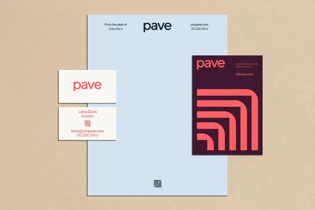
Corporate identity system for Pave featuring a custom sans-serif display type set across business cards, letterhead, and logo applications in a restrained palette of deep burgundy, soft blue, and beige.
Summary
Corporate identity system for Pave, a design/consulting firm, built around a refined sans-serif typeface layered across stationery and brand applications in a restrained palette of deep burgundy, soft blue, and beige.
Visual description
A brand identity mockup showing multiple applications of Pave's type system: a horizontal business card with the wordmark set in a structured geometric sans-serif, a vertical business card using the same typeface in smaller scale, and a cover or poster design featuring large display type in the custom font. The color palette alternates between a cool light blue background, the burgundy wordmark, and warm beige tones. The layout is asymmetrical, with elements floating at different scales across a neutral background, emphasizing the modularity of the letterforms. The typography sits within rectangular blocks that define the composition, creating a structured hierarchy through color blocking and white space.
Key takeaway
The use of a cohesive sans-serif across different scales (wordmark, body, display) to unify a visual identity. The color blocking with a limited warm-cool palette (burgundy anchor + blue + beige) creates sophistication without complexity. The asymmetrical card layouts demonstrate how the same typeface can be recomposed across formats while maintaining a recognizable system.
Reuse notes
Strong template for design consultancies, b2b brands, or professional services where refined typography is the primary visual asset. Works especially well for identity systems where the typeface must carry the brand (no illustration or photography). The beige and burgundy combination reads as established and trustworthy; the cool blue adds contemporary balance. Note that this approach assumes the typeface itself is distinctive enough to anchor the identity.
More like this


Keep what you find
A free account saves references to boards and can send you a weekly email of picks based on what you save.
To see every result, go Pro.