Preview image. Unlock full-res
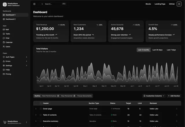
Dark-mode dashboard interface displaying revenue metrics, customer counts, and growth rates with large primary cards and a stacked area chart showing temporal trends.
Summary
Dark-mode dashboard interface displaying revenue metrics, customer counts, and growth rates with large primary cards and a stacked area chart showing temporal trends.
Visual description
Dashboard layout with a dark charcoal background featuring a left sidebar navigation menu and main content area. The top section displays four key metric cards: Total Revenue (showing $1,250.00), New Customers (1,234), Active Accounts (45,678), and Growth Rate (4.5%), each with a percentage change indicator. Below is a stacked area chart titled "Total Values" spanning multiple months with gray-toned filled areas showing overlapping data series. The bottom section shows tabular data with row labels like "Cover page", "Table of contents", and "Executive summary" with columns for Section Type, Status, Target, Users, and Edit Last. Clean monospace typography on dark gray creates clear hierarchy and readability.
Key takeaway
The card-based primary metrics layout with large numbers and secondary context lines (e.g., "Seeing user retention") creates immediate scanability. The stacked area chart with subtle color differentiation works well in dark mode without high contrast strain. Row-based table layouts with icon badges for status (Done, Review) compress information density while maintaining visual clarity.
Reuse notes
Use for admin dashboards, analytics platforms, and SaaS monitoring tools targeting dark-mode users. The metric-cards pattern scales well for KPI overviews. Adapt the area chart approach for time-series data in financial reporting, performance tracking, or data analysis applications where multiple overlaid series are common.
More like this



Keep what you find
A free account saves references to boards and can send you a weekly email of picks based on what you save.
To see every result, go Pro.