Preview image. Unlock full-res
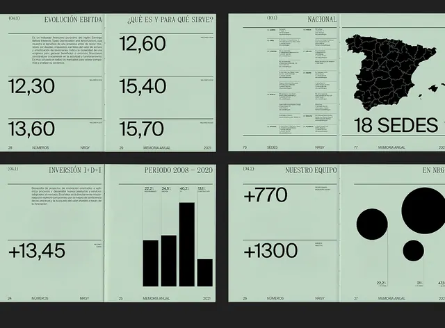
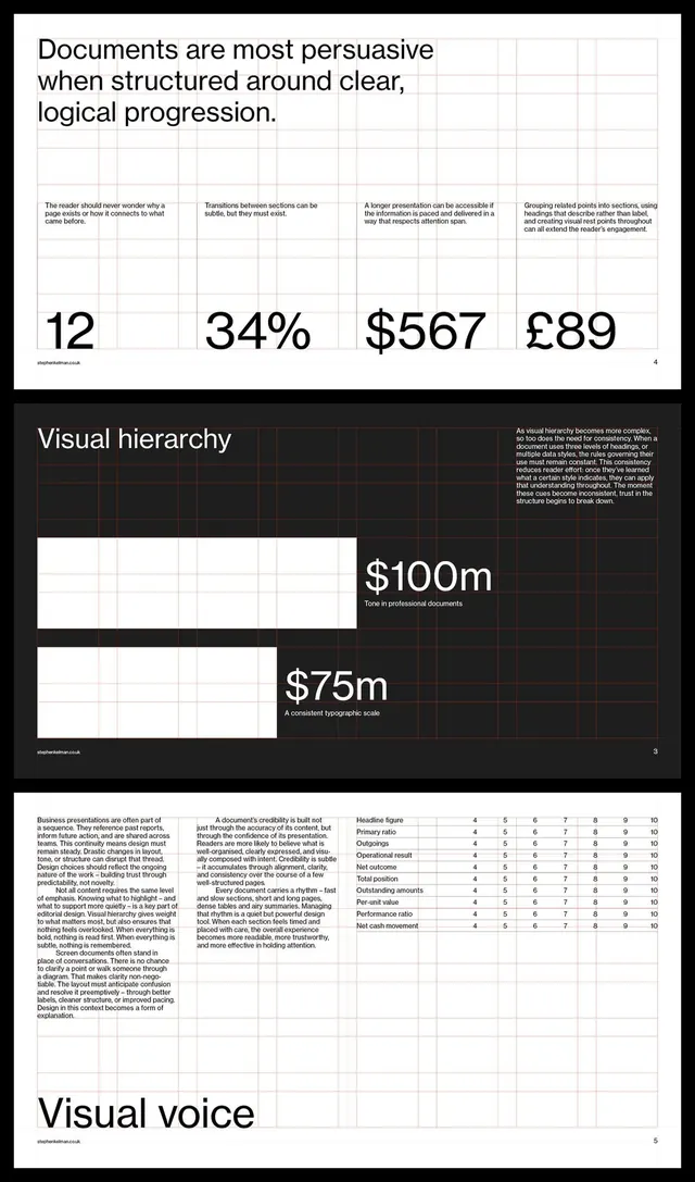
A dense corporate dashboard presenting financial and location data across a grid of panels using monochromatic typography and black bar charts on a pale ground.
Summary
A dense corporate dashboard presenting financial and location data across a grid of panels using monochromatic typography and black bar charts on a pale ground.
Visual description
Pale cream or light gray background divided into a 2-column grid of rectangular panels separated by thin dark dividers. Left panels contain dense gray-text tables with left-aligned numbers in monospace or tabular serif (e.g., 12.30, 12.60, 13.60, 15.40, 15.70). Upper-right panel shows a map of Spain in solid black with "18 SEDES" label. Lower-left has a black bar chart with four vertical bars and axis labels. Lower-right displays large black circles (dots representing data points or metrics). All elements use restrained monochrome: black, white, dark gray, muted sage green. Typography is tight, sans-serif, functional, prioritizing information density over visual breathing room.
Key takeaway
The grid-panel structure breaks dense data into digestible regions without needing color coding. The mix of tables, charts, and map icons in one coherent layout is highly functional. The muted green accent (on panels' background tint) is sophisticated restraint, not a flash of color.
Reuse notes
Perfect for financial dashboards, business intelligence reports, or strategy documents where data clarity and professional credibility matter most. Works well for executive briefings or analytical presentations. The monochrome palette reads as serious and objective. Best suited for business and fintech audiences.
More like this






Keep what you find
A free account saves references to boards and can send you a weekly email of picks based on what you save.
To see every result, go Pro.