Preview image. Unlock full-res
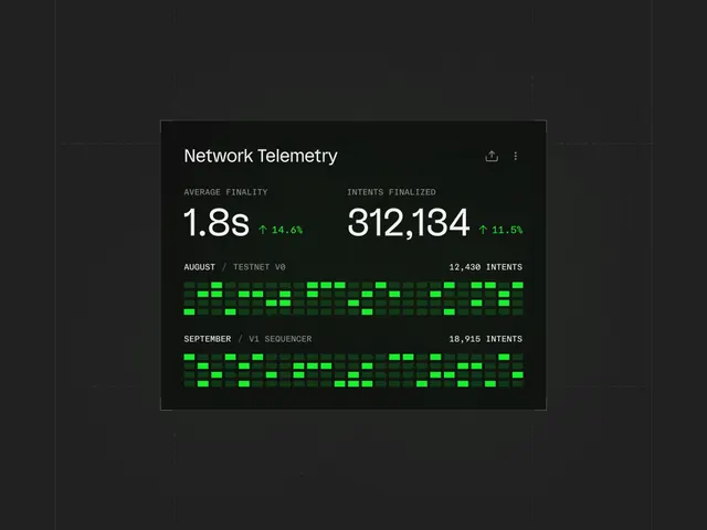
Technical dashboard showing network metrics with neon-green heatmaps, monospace typography, and percentage change indicators.
Summary
A technical dashboard displaying network telemetry with metric pairs (Average Finality, Intents Finalized), neon-green heatmaps, and percent-change callouts on a dark ground.
Visual description
Dark charcoal card container with light border outline. Title "Network Telemetry" at top with action icons (share, menu). Large metric values in white sans-serif: "1.8s" and "312,134" with neon-green upward arrows and percentage changes ("+14.6%", "+11.5%") inline. Two heatmap grids below, each tagged with a dataset label ("AUGUST / TESTNET V0" with "12,430 INTENTS"; "SEPTEMBER / V1 SEQUENCER" with "18,915 INTENTS"). Heatmaps use bright lime-green squares (representing high values) scattered across darker green and charcoal cells in a dot-matrix pattern. Monospace type used for labels and numbers. Minimal visual hierarchy, optimized for information density.
Key takeaway
The neon-green heatmap on dark as a visually punchy way to show temporal or categorical data distribution. The aligned metric blocks with percentage deltas and upward indicators, building quick visual confidence. The monospace typography and dense label spacing for highly technical audiences.
Reuse notes
Ideal for developer tools, DevOps, network monitoring, or analytics dashboards targeting technical users. The neon-green accent is essential to readability; lighter greens will flatten the contrast. Works best when metrics are numerous and updates are frequent.
More like this


Keep what you find
A free account saves references to boards and can send you a weekly email of picks based on what you save.
To see every result, go Pro.