Preview image. Unlock full-res
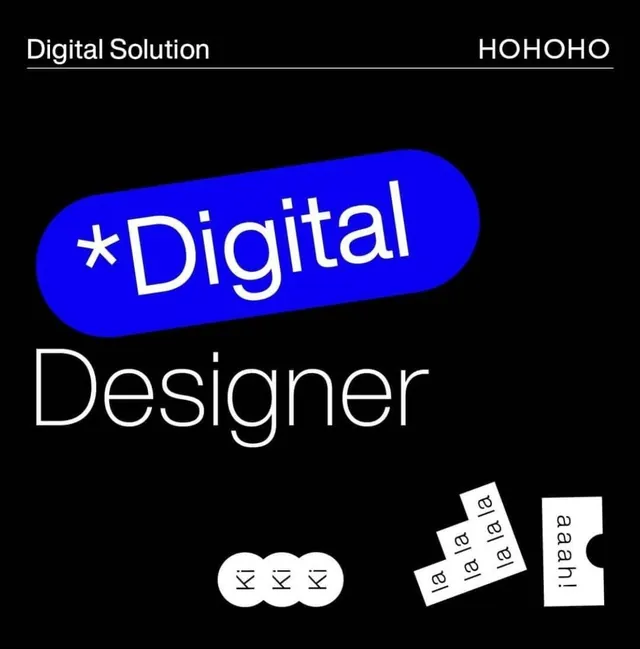
Two bold white logotypes separated by a vibrant blue rounded bar containing an asterisk, anchored by abstract circular and rotated-square graphic marks on a pure black field.
Summary
Two bold white logotypes separated by a vibrant blue rounded bar containing an asterisk, anchored by abstract circular and rotated-square graphic marks on a pure black field.
Visual description
Pure black background with two primary white logotypes: "Digital Solution" at the top left with an underline, and "HOHOHO" at the top right. Between them sits a bright electric blue rounded rectangle containing a white asterisk and the text "Digital Designer". Below are three elements: three white circles arranged horizontally with "Kl" inside each, a rotated stack of cards with "la la" repeating text, and an angular white bracket shape. The composition balances typography with geometric accent marks, using the blue shape as the primary color anchor.
Key takeaway
The single bright accent (the blue rounded bar) providing visual hierarchy on an otherwise monochromatic typographic layout. The modular use of simple geometric marks (circles, rotated cards, brackets) to add texture without cluttering. The restraint of pure white and black creating technical legibility.
Reuse notes
Strong for developer-tool, SaaS, or startup identity work needing an unconventional mark system. The high-contrast setup works well at small sizes for icon or avatar use. The asterisk shape-as-symbol approach pairs with minimalist brand systems.
More like this



Keep what you find
A free account saves references to boards and can send you a weekly email of picks based on what you save.
To see every result, go Pro.