Preview image. Unlock full-res
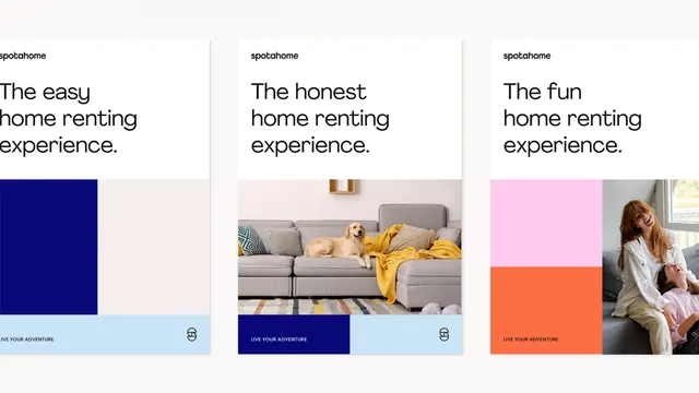
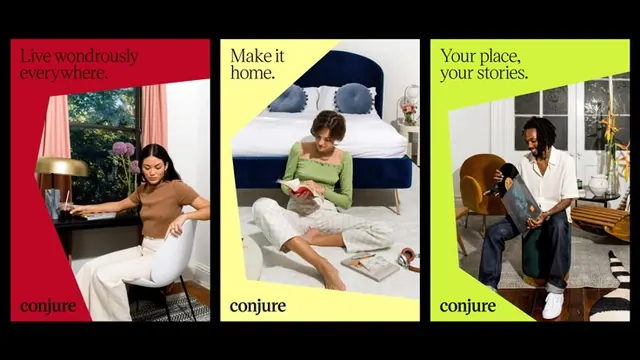
Three-card grid pairing color-blocked panels with lifestyle photography and distinct positioning claims for a rental-services brand, each card anchored by a CTA button.
Summary
A three-card marketing layout for a rental marketplace using distinct color blocks and lifestyle photography to position different user segments (easy, honest, fun rental experiences).
Visual description
Three equal-width cards in grid layout. Card 1: navy-blue color block (upper half) with white sans-serif "spotathome" logo, cream text block below with "The easy home renting experience." and white CTA. Card 2: interior photograph (neutral sofa with yellow blanket, warm apartment setting) occupying upper two-thirds, dark navy CTA block below with white text "spotathome" and "The honest home renting experience." Card 3: pale pink/mauve color block paired with lifestyle photograph of woman in casual wear, pink/coral CTA button. Throughout: sans-serif typography, tight spacing, horizontal accent lines beneath each headline, consistent branding.
Key takeaway
The card rhythm using photography and color interchangeably to break monotony; tight integration of brand claim (tagline), image mood, and color so each card has distinct personality; the horizontal divider line between headline and CTA creating micro-rhythm; a small brand mark on each card tying the suite together.
Reuse notes
Flexible template for marketplace/rental brands needing to convey multiple positioning angles at once. The color blocking allows fast scanning; photographs humanize without being hero-scale. Works across 2-4 cards; scale the concept to match category count.
More like this





Keep what you find
A free account saves references to boards and can send you a weekly email of picks based on what you save.
To see every result, go Pro.