Preview image. Unlock full-res
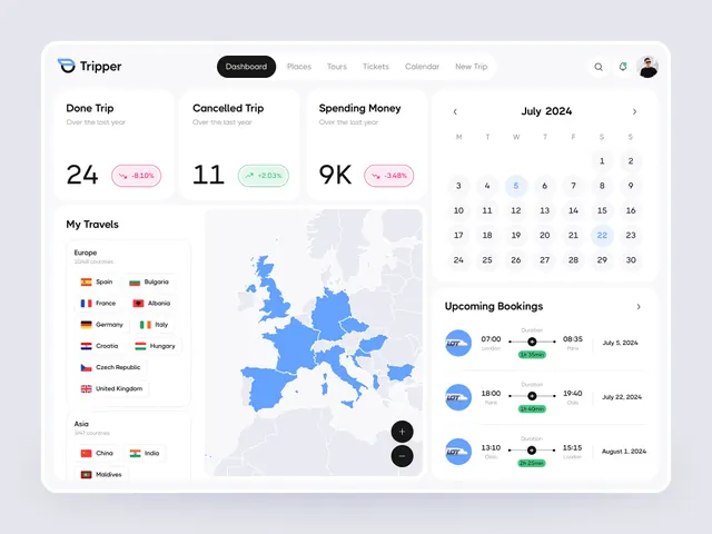
Travel management dashboard integrating trip statistics, a geopolitical map, calendar widget, and upcoming booking cards in cool blue and lavender palette.
Summary
Travel management dashboard integrating trip statistics, a geopolitical map, calendar widget, and upcoming booking cards in cool blue and lavender palette.
Visual description
A desktop SaaS dashboard for a travel app called Tripper. The layout is split into sections with generous negative space and soft rounded containers. Top left: logo and navigation tabs (Dashboard, Places, Tours, Tickets, Calendar, New Trip) with search and profile icons. Below, three metric cards display trip summary data: "Done Trip: 24" with a pink-red trend badge (down 8.10%), "Cancelled Trip: 11" with a mint-green badge (up 20.03%), "Spending Money: 9K" with a pink badge (down 34.8%). A "My Travels" section lists visited regions with flag icons (Europe: Spain, France, Germany, Italy, Croatia, Hungary, Czech Republic, United Kingdom; Asia: China, India, Maldives). To the right, an interactive map of Europe showing visited countries in bright blue. Below the map, a calendar widget for July 2024 with date navigation. At the bottom right, an "Upcoming Bookings" section with three booking cards showing carrier logos, times, and flight durations. The color palette is dominated by light lavender-gray background, white card surfaces, cool blue accents (map, navigation highlight), and soft pink/mint status badges. Typography is clean sans-serif with clear contrast and hierarchical sizing.
Key takeaway
The modular card-based layout that balances data density with visual whitespace. The use of soft, pastel status badges (pink for negative, mint for positive trend) instead of harsh red/green for financial/quantitative display. The integration of contextual mapping visualization that grounds location-based data spatially. The controlled accent color (cool blue) that ties related elements (map, selected nav, date indicator) without overwhelming the neutral palette.
Reuse notes
Ideal template for travel SaaS, booking platforms, expense-tracking apps, or any multi-dimensional data dashboard. The cool blue and lavender palette reads premium and calm, suitable for financial and planning apps. Works on desktop and scales down to tablet in a grid. The card-based modular design allows easy addition of new metrics. Avoid if your audience needs high-saturation or warm branding; this palette skews cool and reserved. The metric cards pair well with trend badges for KPI dashboards in fintech and productivity spaces.
More like this


Keep what you find
A free account saves references to boards and can send you a weekly email of picks based on what you save.
To see every result, go Pro.