Preview image. Unlock full-res
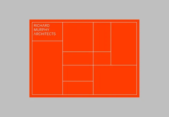
Portfolio design for Richard Murphy Architects using a bold red rectangle divided by white grid lines into irregular modular cells, with the studio name in white sans-serif in the top-left cell.
Summary
Portfolio design for Richard Murphy Architects using a bold red rectangle divided by white grid lines into irregular modular cells, with the studio name in white sans-serif in the top-left cell.
Visual description
A bright red rectangular frame sits on a gray background. Inside the frame, white strokes divide the space into an irregular grid of 12 cells of varying sizes, arranged asymmetrically. The top-left cell contains the white sans-serif text "RICHARD MURPHY ARCHITECTS" aligned to the left. All other cells are empty red space. The white border around the entire rectangle and the internal divisions create strong visual rhythm through precise geometry.
Key takeaway
The principle of using a strict grid system as an identity element itself, not just a layout tool. The contrast of rigid white lines against bold saturated color. The restraint of leaving most grid cells empty, trusting negative space and the grid structure alone to carry interest.
Reuse notes
Ideal for architecture, design, and creative studios where process and structure are part of the brand narrative. The bold red and white palette reads as confident and energetic; use when you want personality within a modular framework. Scale the grid cell proportions and complexity to match your content density.
More like this








Keep what you find
A free account saves references to boards and can send you a weekly email of picks based on what you save.
To see every result, go Pro.