Preview image. Unlock full-res
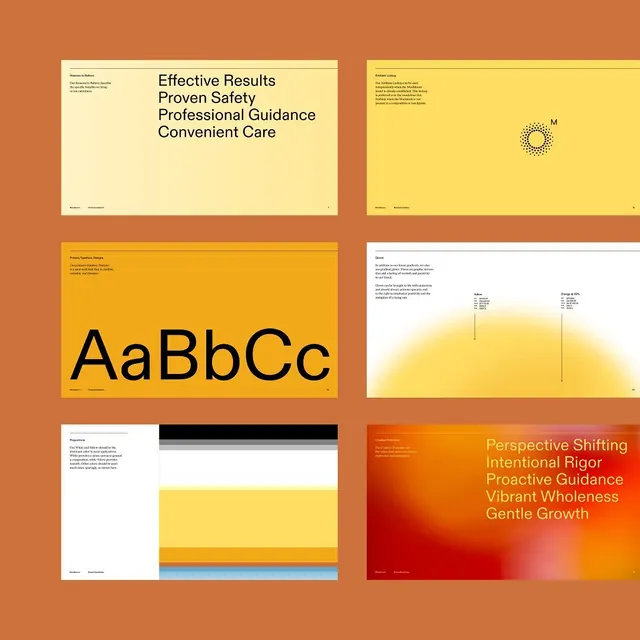
Systematic brand guideline spread showing typography, color palette, and application layouts in a warm palette of burnt orange, golden yellow, and cream on a burnt-orange background.
Summary
A brand system presentation laid out in a 2x3 grid showing typography specimens, color palette applications, and layout variations unified by a warm burnt-orange, golden-yellow, and cream palette.
Visual description
Six rectangular compositions on a burnt-orange background arranged in a 2x3 grid. Top row: a cream card with serif body copy and a small sun icon; a pale-yellow card with centered sun illustration. Middle row: a bright golden-yellow card displaying large black sans-serif letters "AaBbCc" as a typeface specimen; a white card with light illustration and small gray text, punctuated by a line of sky-blue and charcoal accent bars. Bottom row: a pale-yellow card with horizontal color bars (charcoal, light blue) and small gray text; an orange-to-pink gradient card with white sans-serif body copy and right-aligned text reading "Perspective Shifting, Intentional Rigor, Proactive Guidance, Vibrant Wholeness, Gentle Growth." White hairline rules separate the grid cells.
Key takeaway
The warm color palette projects confidence and approachability without feeling corporate-cold. The modular grid structure (six equal cells with consistent gutters) makes the system feel organized and repeatable. Typography is given dedicated space (the oversized "AaBbCc" spreads the font family clearly). Color bars and accent hues introduce secondary applications without cluttering the layout.
Reuse notes
Strong template for consulting, professional services, or corporate brands wanting to feel warm and systematic. The burnt orange and golden yellow pair well together and stand out from tech-industry blue defaults. Works for brand guidelines, RFP responses, or capability decks. Color accuracy matters; test the palette in context before applying broadly.
More like this









Keep what you find
A free account saves references to boards and can send you a weekly email of picks based on what you save.
To see every result, go Pro.