Preview image. Unlock full-res
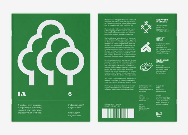
A two-panel design system for LogoArchive, featuring a geometric tree icon composed of overlapping white circles on forest green, paired with extensive system documentation.
Summary
A two-panel design system poster for LogoArchive, pairing a minimalist geometric tree icon with its systematic documentation and metadata.
Visual description
Left panel: forest green background with a stylized tree composed of three overlapping white circles, arranged vertically to suggest canopy layers. The LogoArchive wordmark appears in lowercase white sans-serif at lower left, with body copy below. Right panel: continuation of the system documentation set against white-cream, with aligned body text in black sans-serif, supplemented by small icon guides (house, hands, building symbols) in white circles at lower right, and a barcode grid at bottom.
Key takeaway
The geometric tree built from simple overlapping circles is elegant and memorable. The two-panel format (hero icon + documentation) is clear and instructional. The green-and-white restricted palette enforces institutional credibility without feeling sterile.
Reuse notes
Well-suited for nonprofit, environmental, or institutional branding systems. The grid-based typography and restrained color palette anchor it as authoritative identity work, not decorative. Works as a printed booklet or poster series for style-guide distribution.
More like this



Keep what you find
A free account saves references to boards and can send you a weekly email of picks based on what you save.
To see every result, go Pro.