Preview image. Unlock full-res
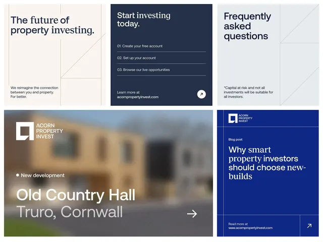
Property investment platform interface with asymmetric grid layout combining text, CTA overlay card, property photography, and blog teaser in navy, cream, and accent blue.
Summary
A property investment website dashboard layout with asymmetric grid combining a navy CTA card, property photography, numbered process steps, and blog content block in cool, high-contrast palette.
Visual description
A four-section layout on a cream background. Top left: large heading "The future of property investing" with body copy and neutral subtext on an off-white panel. Top right: dark navy card with "Start investing today" heading and three numbered steps (01, 02, 03) in white sans-serif, with a circular learn-more button. Bottom left: landscape property photograph with dark overlay containing Acorn Property Invest wordmark and white body copy ("New development, Old Country Hall, Truro, Cornwall") with arrow CTA. Bottom right: solid navy panel with blog teaser heading "Why smart property investors should choose new-builds" in white sans-serif, read-more link, and property image thumbnail inset. Color blocking uses navy (#253048) for CTAs and blog section, cream for main surface, white for text on dark, and soft off-white for neutral content areas. Typography is consistent sans-serif with strong hierarchy via size and weight variation.
Key takeaway
The numbered-steps card (01, 02, 03) on dark background creates scannable signup flow. Asymmetric grid breaks traditional two-column symmetry while staying organized. Layering property image with dark overlay + white text ensures readability of copy over photography. Navy and cream provides strong contrast without coldness.
Reuse notes
Strong for fintech, real-estate, or investment platforms where step-by-step onboarding and property showcase are both critical. The dark navy-on-cream splits content types clearly (process, imagery, blog). Accessible color contrast supports broader user bases. Works at desktop scale; may need responsive restructuring for mobile.
More like this



Keep what you find
A free account saves references to boards and can send you a weekly email of picks based on what you save.
To see every result, go Pro.