Preview image. Unlock full-res
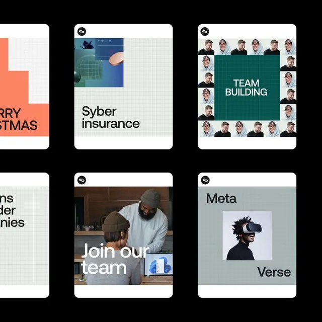
A modular grid of six corporate brand identity cards demonstrating consistent white-space and typography hierarchy across insurance, recruitment, and tech sectors.
Summary
A modular grid of six corporate brand identity cards demonstrating consistent white-space and typography hierarchy across insurance, recruitment, and tech sectors.
Visual description
Six rounded-corner cards arranged in a 3x2 grid against black, each with a white border or frame accent. Each card pairs either flat color fields, icon illustrations, or photography with sans-serif headlines and descriptive text. Top row: left card shows an orange block and white grid on cream (partial text visible); center card features blue-green abstract geometric illustration above "Syber insurance" headline; right card displays a ring of portrait photographs around teal center with white "TEAM BUILDING" text. Bottom row: left card extends the grid motif; center card shows two people in a workshop with "Join our team" headline overlaid in white sans-serif; right card displays blue VR headset icon on pale gray-green field above "Meta Verse" text. White circular logo badges appear consistently in the top-left of each card. Consistent spacing, weight, and color application across all six demonstrates scalable brand system.
Key takeaway
The card-based container system as a flexible vehicle for mixing photography, illustration, solid color, and text at equal visual weight. The consistent badge/logo placement and small-caps label approach for fast categorization. The alternating rhythm of content types (color, icon, photo) keeping the grid visually dynamic without breaking the modular structure.
Reuse notes
Excellent template for corporate recruitment, insurance, or tech team-building communications where you need to present varied content (products, people, services) under one visual language. The teal and orange palette is restrained enough to work for b2b contexts while still having personality. Scales well down to small thumbnails due to clear type hierarchy.
More like this




Keep what you find
A free account saves references to boards and can send you a weekly email of picks based on what you save.
To see every result, go Pro.