Preview image. Unlock full-res
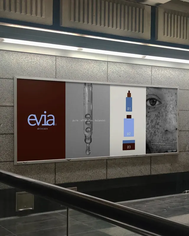
Modular retail display wall for evia skincare featuring minimal color blocking in earth tones, numbered product bottles, and typography on burgundy and neutral panels.
Summary
A modular retail display system for evia skincare featuring a numbered product lineup (01, 02, 03) arranged across coordinated panels in warm earth tones, burgundy, and neutrals with integrated lifestyle photography.
Visual description
An in-situ retail wall display mounted on textured concrete panels with a linear light strip overhead. Left panel: deep burgundy background with evia wordmark and "skincare" tagline in light blue sans-serif. Center panels: gray and cream sections showing product bottles in a step-wise sequence (numbered 01, 02, 03) with complementary hero imagery including close-up beauty photography and a pump bottle rendering. Right panel: black and white portrait photography of a face. The entire composition uses a strict vertical and horizontal grid, with color blocking creating distinct zones of attention. Typography is clean and hierarchical, with generous negative space separating the product bottles from other content.
Key takeaway
The numbered product sequence (01, 02, 03) creates an intuitive onboarding narrative. The contrast between deep burgundy and cream panels anchors brand identity while allowing product visibility. Modular frame structure allows customization by location or campaign rotation.
Reuse notes
Effective for prestige skincare, cosmetics, or personal care launches where a step-wise progression (cleanse, treat, moisturize) can drive purchase decision. Works well in high-traffic retail or showroom contexts. The warm earth-tone palette suggests premium, botanical positioning.
More like this

Keep what you find
A free account saves references to boards and can send you a weekly email of picks based on what you save.
To see every result, go Pro.