Preview image. Unlock full-res
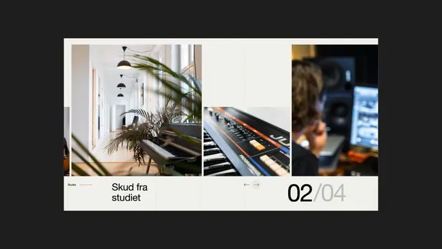
A carousel interface displaying three detail photographs of a studio space, keyboard, and person at work, with slide counter and navigation arrows framing the layout.
Summary
A carousel interface displaying three detail photographs of a studio space, keyboard, and person at work, with slide counter and navigation arrows framing the layout.
Visual description
Three rectangular photo panels arranged horizontally within a light cream-white border. The left panel shows a minimalist studio hallway with pendant lights and a potted palm. The center panel is a close-up of a keyboard controller with orange accents. The right panel shows a blurred person working at a desk in warm light. Below the photos sits a clean horizontal layout with a "Studio" label on the left, the project title "Skud fra studiet" in black sans-serif, left and right navigation arrows in the center, and a step counter "02 / 04" in the lower right. The entire composition sits on a dark charcoal background. Typography is modern sans-serif in black and light gray. The palette is strictly neutral: cream, light gray, warm grays, and deep charcoal.
Key takeaway
The carousel grid as a compact way to show multiple project details without overwhelming the frame; the step counter ("02 / 04") as a visual cue that there are more slides; the minimal border treatment that makes the photos feel like a curated collection, not a gallery.
Reuse notes
Strong for portfolio websites, case study presentations, or project showcases where you want to display multiple perspectives of a single project. The three-column layout works well for before-after-process narratives or for showing different angles of a space, product, or idea. The navigation arrows and counter invite interaction and suggest a larger story. Works best with photography that has consistent depth and mood. The neutral frame keeps focus on the images themselves. Adapt the label and counter to your project naming; scale the photo grid to fit your content and screen size.
More like this




Keep what you find
A free account saves references to boards and can send you a weekly email of picks based on what you save.
To see every result, go Pro.