Preview image. Unlock full-res
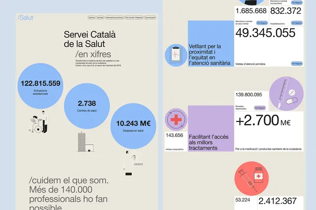
A data-driven infographic system visualizing key metrics for the Catalan Health Service, using bubble charts and health-focused icons in muted pastels against cream.
Summary
A data-driven infographic system for the Catalan Health Service showing key metrics and services through bubble charts and minimal health-care icons.
Visual description
Cream background split into left and right panels. Left: headline and medium blue bubble chart with three circles labeled "122.815.559" (assistencies), "2.738" (centres de sante), and "10.243 ME" (despeses en salut), with small monochrome illustrations of patients and buildings. Right: smaller bubble groupings in pastel blue and soft purple circles, showing additional metrics ("49.345.055", "139.800.095", "+2.700 ME", "2.412.367") paired with icons (clipboard, syringe, cross). All typography in clean sans-serif, hierarchical sizing from headline to metadata. Teal accent pills label sections.
Key takeaway
Bubble charts convey magnitude at a glance while remaining visually calm. Pairing large numbers with small, monochrome context illustrations keeps emphasis on the data without visual noise. The soft pastel palette (blue, purple) instills trust without sterility, fitting for public health communication.
Reuse notes
Ideal for government, healthcare, or nonprofit dashboards needing to communicate multiple statistics in one view. The muted color scheme and modular bubble layout scale well for print or digital. Avoid when audiences need interactive drill-down; this is summary-focused.
More like this


Keep what you find
A free account saves references to boards and can send you a weekly email of picks based on what you save.
To see every result, go Pro.