Preview image. Unlock full-res
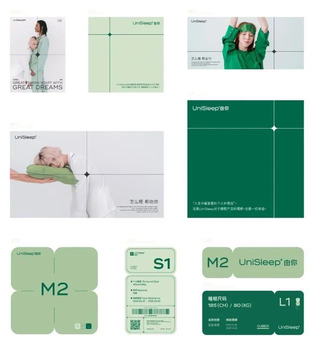
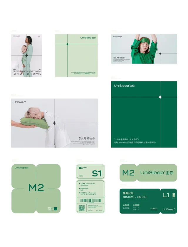
A complete visual identity for a sleep wellness brand featuring a modular rounded-square grid system, bilingual Chinese/English typography, and cool green-to-teal palette.
Summary
A modular brand system built on rounded-square badge units in deep green and sage, used across product packaging, labels, tags, and promotional materials for a bilingual (Mandarin/English) sleep wellness company.
Visual description
The system showcases overlapping use cases: lifestyle photography featuring parents and infants with the brand applied as minimal logotypes; a sage-green poster with centered cross-axis dividing the composition; product labels (rectangular rounded cards) showing sizing information (185cm/80kg), product codes (S1 model numbers), and material callouts on deep green. Bottom row displays modular badge compositions stacking 2-4 rounded squares in pairs or groups, each containing brand marks, product variants (M2, L1), or informational text in sans-serif. QR codes appear integrated into some badges. The palette shifts from light sage and cream in the photography spreads to saturated deep green in the packaging labels. Connecting elements (small diamond shapes) punctuate the grid intersections.
Key takeaway
The rounded-square badge system is infinitely adaptable for labeling, tagging, and organizing information. The cool green communicates wellness and calm while remaining contemporary. Pairing photography with minimal graphic elements prevents the design from feeling too clinical. The grid-based composition creates visual coherence across disparate touchpoints.
Reuse notes
Ideal for healthcare, wellness, and consumer goods brands where calmness and trustworthiness are core values. The modular unit translates well to packaging, digital products, and signage. Works with bilingual or multilingual copy. Avoid if your brand requires warmth or playfulness; the cool palette reads reserved. The deep-to-light green gradient is soothing but demands good contrast with dark body text.
More like this



Keep what you find
A free account saves references to boards and can send you a weekly email of picks based on what you save.
To see every result, go Pro.