Preview image. Unlock full-res
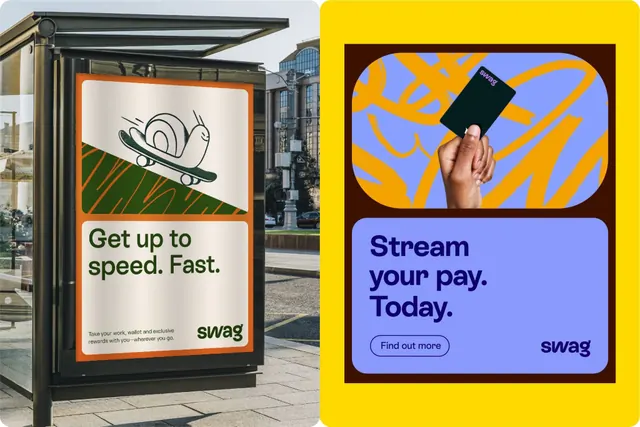
Fintech brand campaign showing speed and payment concepts through a two-panel composition, split between bright yellow and purple with illustrative and photographic elements.
Summary
Fintech brand campaign showing speed and payment concepts through a two-panel composition, split between bright yellow (left) with illustrated skateboard icon and purple (right) with photographic hand holding a card.
Visual description
A two-panel marketing composition for the Swag fintech platform. Left panel: yellow background with an illustrated hand-drawn skateboard in black line art, below which sits display-weight sans-serif type reading "Get up to speed. Fast." with small supporting text about rewards. Right panel: dark chocolate-brown background containing a rounded-corner purple card with a photo of a hand holding a black payment card against an orange and blue geometric striped background. Below is white serif typography reading "Stream your pay. Today." with a teal button labeled "Find out more." The Swag logo appears in the bottom right.
Key takeaway
Using warm (yellow) and cool (purple) on opposite sides creates visual separation without needing a vertical divider. The illustrated icon on one side and photographic element on the other adds variety without breaking cohesion. The color pairing (yellow/purple) is bold but backed by financial trust through professional typography and clear CTA hierarchy.
Reuse notes
Effective for fintech, payment, or gig-economy platforms emphasizing speed and accessibility. The skateboard metaphor works for youth-facing or lifestyle-adjacent services. The two-panel format splits discovery (what you do) from conversion (how to start). Yellow-purple contrast is risky for certain audiences but high-impact for finance where trust-building is visual.
More like this




Keep what you find
A free account saves references to boards and can send you a weekly email of picks based on what you save.
To see every result, go Pro.